Cumulative Layout Shift (CLS): What It Is and How to Improve It
Cumulative Layout Shift (CLS) is a metric that evaluates site experience by measuring how much your site’s pages shift unexpectedly.
Even though there are several site elements that impact user experience, a poor CLS score also affects your website’s search engine optimization (SEO). Therefore, understanding what CLS is and how to achieve a good CLS score helps improve your website’s performance overall.
In this article, we will discuss the different ways to measure a CLS score. We will also explain what elements influence it and answer some frequently asked questions about CLS at the end of this article.
Let’s begin by answering the main question: what is CLS?
What Is Cumulative Layout Shift (CLS)?
Cumulative Layout Shift measures the visual stability of web pages, calculating the total amount of unexpected layout shifts on a web page. A layout shift happens when a visible element changes its position or size, moving the content around it.
Cumulative Layout Shift Score Impact on SEO
Cumulative Layout Shift is a ranking factor in Google as it affects the website’s performance and user experience. It is one of the Core Web Vitals metrics, and Google can penalize a site that does not meet its standard.
A poor CLS score indicates that a website is unreliable, which can cause visitors to leave faster. So, optimizing your website for a high CLS score is an essential component of a successful SEO strategy.
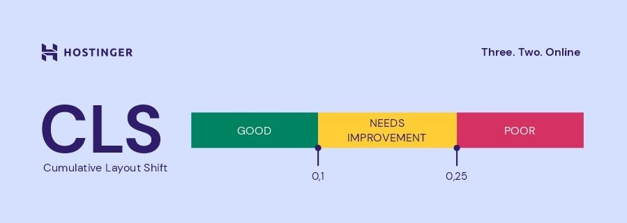
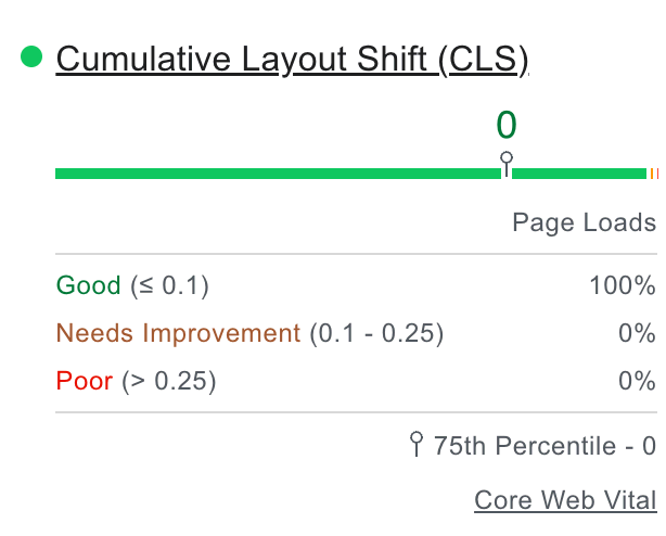
What Is a Good CLS Score?
A high CLS score indicates a considerable number of unexpected layout shifts on a web page. On the other hand, a fully static page can score as low as zero.
Google has set a standard for all Core Web Vitals metrics to help site owners measure and improve their CLS scores:
- Good – below 0.1 is the acceptable score according to Google’s standard.
- Needs improvement – between 0.1 to 0.25 indicates you need to make changes to reduce unexpected shifts.
- Poor – above 0.25 can damage your site’s ranking.
A website can have different CLS scores for different web pages and screens. Layout shifts on mobile screens have a more significant impact on mobile user experiences.
Further Reading on Core Web Vitals
What Is Largest Contentful Paint and How to Optimize for It
What Is First Input Delay and How to Improve It
INP: Understanding the New Core Web Vitals Metric and How to Optimize for It
How to Improve Your Core Web Vitals: 10 Effective Ways + A Case Study
How to Measure Your Cumulative Layout Shift Score
Here are two popular methods to do a Cumulative Layout Shift test:
- In the lab – simulate the user’s experience in a controlled environment.
- In the field – based on real user interactions.
There’s no better method, as using both will provide more reliable data about your website performance. To help measure your website’s CLS, Google has multiple tools available for free.
Option 1. Measuring CLS in the Lab
When measuring CLS in the lab, the result accounts for a small range of possible situations. Most browser developer tools offer a way to calculate the CLS score of a web page, often displaying a rectangle overlay showing the affected regions.
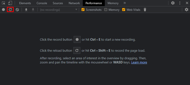
Here are the steps to measure CLS using Google Chrome’s Developer Tools:
- Click your browser menu and head to More tools -> Developer tools. Another option is to press Ctrl + Shift + I and select the Performance panel.
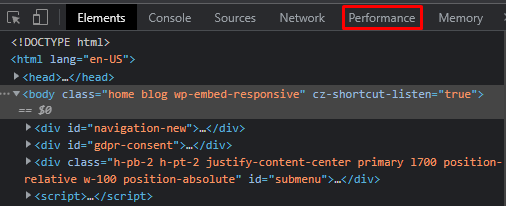
- Check the Web Vitals option and click on the reload button or press Ctrl + Shift + E to record the page load.
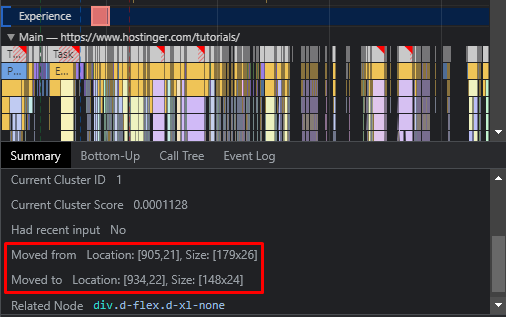
- Wait for the result and click on the Layout Shift tab next to Experience. The tool will show the Cumulative Score under Summary.
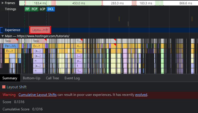
Note that there might be multiple Layout Shift tabs that give different scores due to various visual elements showing layout changes. Click on each tab to see which element is causing the issue on your web page.
Other tools that help measure CLS in a controlled environment include Lighthouse and the Chrome Web Vitals extension.
Option 2. Measuring CLS in the Field (Real User Data)
The other method measures real user interactions using the Chrome User Experience Report (CrUX) as the primary source of data, helping to analyze your website’s performance overall.
A popular tool to help measure your real user data is PageSpeed Insights. Here are the steps to use PageSpeed Insights to calculate a web page’s CLS score:
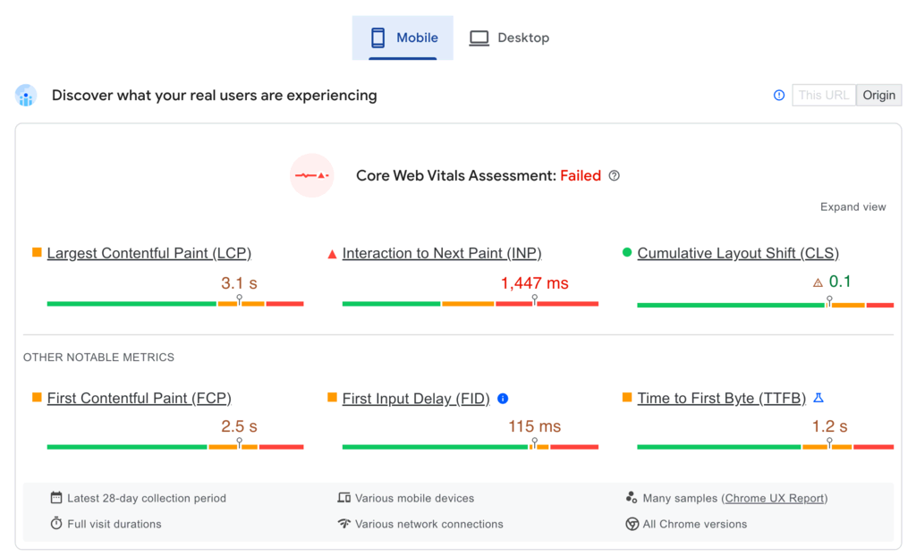
- Enter a web page URL and click on the Analyze button to test its performance.
- PageSpeed Insights will show the overall Core Web Vitals Assessment and whether the web page meets Google’s standard. The tool will show the result for Mobile devices first.
- Click on Desktop to find the CLS score for desktop devices. Notice how the score can be different on different screens.
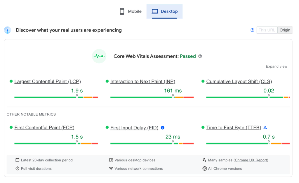
- Click on Expand view to understand the score better.
Other popular tools to help measure CLS in the field are BigQuery and Looker Studio.
Understanding How the CLS Score Is Calculated
Understanding how to calculate the Cumulative Layout Shift score will help optimize it. CLS scores measure two elements in an unexpected layout shift:
- The impact fraction – measures the effect of an unstable element on the viewport.
- The distance fraction – measures how far the element moves on the viewport.
The calculation to get a CLS score is:
Final CLS score = Impact fraction x Distance fraction
Impact Fraction
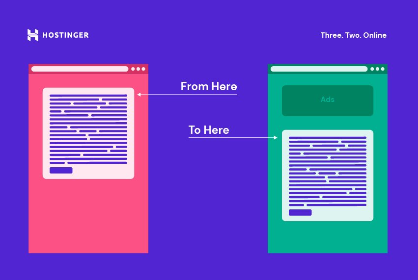
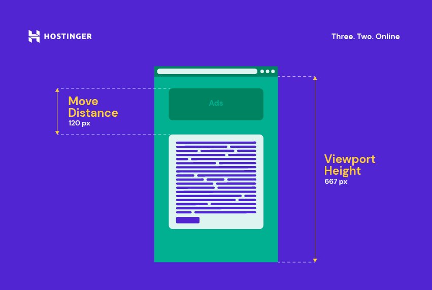
Impact fraction measures how much space an unstable element takes up in the viewport area. When visible elements unexpectedly shift to another area, the impact fraction calculates the total area the shift takes:
Impact fraction = Impact region / Viewport area
This score demonstrates how unstable elements impact the overall website performance.
Distance Fraction
Distance fraction measures the biggest distance that unstable elements have moved during unexpected layout shifts. The calculation to get the distance fraction is:
Distance fraction = Maximum move distance / Viewport area
The score demonstrates how far an existing element moves other elements when shifting unexpectedly.
How to Find Which Element Is Causing a Poor CLS Score
If a web page has a poor CLS score, some elements to look into are:
- Banner ads, embeds, iFrames, image, and video elements without size specifications.
- Dynamic content above the current viewport, without a placeholder for screen size.
- Custom fonts that change the rendering behavior.
These actions often wait for a network response to upload elements, which causes higher unexpected layout shifts.
The tools to measure a web page’s CLS score can also point out the specific elements that may cause an issue with layout shifts.
For example, the Performance panel on a browser’s developer tools shows the unstable elements on the Layout Shift tab.
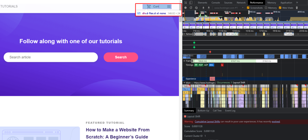
The Summary also shares an unstable element’s original and new Location and Size.
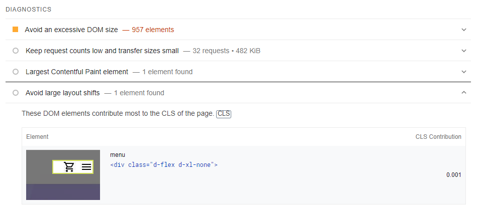
On PageSpeed Insights, look for more details on the element causing unexpected shifts under the DIAGNOSTICS section.
How to Improve Your Cumulative Layout Shift Score
CLS score is a ranking factor, so optimizing it will help drive more traffic to your site. Here are four ways to improve your CLS score, along with the difficulty level and impact of each method.
1. Defining Dimensions for Images and Videos
Difficulty Level: Easy
Impact: High
All image and video elements on a web page need width and height size attributes to avoid unexpected shifts. An example of how to set your width and height attributes looks like this:
<img src="example.jpg" width="400" height="400" alt="Example of an image.">
However, responsive images need to use the same aspect ratio to help browsers calculate the correct amount of required space to display them.
The srcset attribute defines a set of different image sizes using the same aspect ratio to help browsers deliver responsive images correctly. Here is an example of what the code looks like using this attribute:
<img width="1000" height="1000" src="example-1000.jpg" srcset="example-1000.jpg 1000w, example-2000.jpg 2000w, example-3000.jpg 3000w" alt="Example of an image.">
Most modern browsers can also set the default aspect ratio based on the image or video’s width and height attributes. So, a way to prevent layout shifts is by using CSS aspect ratio boxes like in the example below:
img {
aspect-ratio:attr(width)/attr(height);
}
This code helps the browser predict the different aspect ratios by following the image dimensions while loading it.
2. Setting Width and Height Banner Ads, Embeds, and iFrames
Difficulty Level: Medium
Impact: High
Reserving space for banner ads, embeds, and iFrames helps to avoid layout shifts.
Banner Ads
Banner ads pushing visible content can cause high layout shifts, which leads to a suboptimal user experience. Ad networks and publishers that support dynamic ad sizes should reserve a placeholder beforehand to prevent poor CLS scores.
Style the element before the ad tag library loads to prevent banner ads from pushing visible content. Applying this method is also important when an ad fills an entire page’s row or column to prevent layout shifts even if the ad does not load.
Use the slot element to specify the ad size using the min-height and min-width CSS properties:
<div id="ad-slot" style="min-width: 300px; min-height: 250px;"></div>
In addition, add CSS media queries to specify different minimums when using different screen sizes:
@media screen and (max-width: 970px) {
  #ad-slot {
    min-height: 250px;
  }
}
Use your historical data to choose the best size for the ad slot. Make sure to consider various form factors and subtle differences in ad sizes.
This method also works when you insert non-sticky ads to a web page. By adding the required space, ads will not trigger layout shifts when loaded off-screen.
Embeds and iFrames
Embeds can take various forms, so it is easier to be unsure of their size on a web page. Therefore, platforms do not always reserve the required space for embeddable widgets and applications.
Similarly, an Inline Frame (iFrame) also brings third-party elements to a web page, which may cause layout shifts.
To avoid having embeds and iFrames causing poor CLS scores, inspect their sizes using your browser developer tools. Click on the pointer icon on the upper left corner of the developer tools and select the elements you want to inspect.
After selecting the element, the tool will show its size.
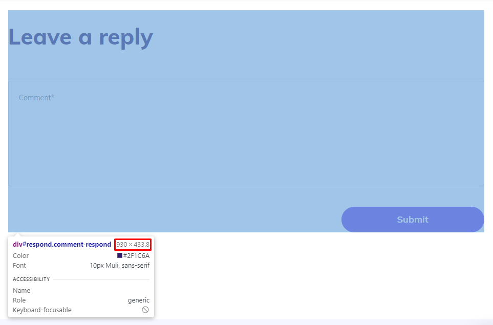
Add these sizes to your embeds or iFrames elements.
3. Using font:display for Custom Fonts
Difficulty Level: Medium
Impact: Medium
Adding a custom font to your website can increase the CLS score by causing:
- Flashes of Invisible Text (FOIT) – page rendering will display invisible text or a blank font until it loads the custom font.
- Flashes of Unstyled Text (FOUT) – browsers display a fallback font until they load the custom font, momentarily ignoring the page layout.
Loading a custom web font can cause the layout to shift significantly, often due to using a different amount of space than the system font requires. Use font:display values, such as auto, fallback, block, swap, and optional, to avoid invisible and unstyled text.
Another way of avoiding significant style changes to your web fonts is by choosing a similar system font:
@font-face {
  font-family: 'Pacifico';
  src: local('Pacifico Regular'), local('Pacifico-Regular'), url(www.examplefonts.woff2) format('woff2');
  font-display: swap;
}
With Google custom web fonts, prevent layout shift by adding &display=swap after your link:
<link href="https://fonts.googleapis.com/css?family=Roboto:400,700&display=swap" rel="stylesheet">
Adding a <link rel=preload> value to your font file will also help avoid layout shifting when loading custom web fonts.
4. Reviewing Dynamically Injected Content
Difficulty Level: Medium
Impact: High
Another reason behind a CLS issue is dynamic content. Websites often use dynamic content to attract visitors to complete a specific action. However, when a new content element pops up at the top or bottom of a page, it often shifts the content around it.
Therefore, avoid injecting dynamic content above existing content. Some of the ways to review dynamically injected content include:
- Inviting users to initiate changes – add a user interaction element to trigger new content load to prevent unexpected shifts. Some examples include a Read more or a Refresh button. Note that you should keep the layout shifts within 500ms to avoid affecting CLS.
- Loading content off-screen – since shifts that happen off-screen do not contribute to CLS, another option is to load dynamic content outside the user viewport and use an overlay to invite users to see it, such as a Scroll Up notification.
- Using a fixed size container – helps prevent shifting your layout. One of the options is using a carousel, which is also a suitable alternative if your dynamic content replaces an element with another. Ensure that any links or controls wait for the transition to avoid accidental clicks.
Conclusion
Cumulative Layout Shift measures unexpected changes within the user viewport area to evaluate user experience. Also, as a Google ranking factor, CLS significantly impacts your SEO.
A web page with great visual stability has a CLS score below 0.1, while anything above 0.25 indicates poor performance. We presented two methods to measure CLS: in the lab and the field. While it’s possible to choose a single method, using both will produce more reliable results about the website performance.
After discussing how to identify the elements increasing your CLS score, we have shared how to fix cumulative layout shift issues using these four methods:
- Defining dimensions for images and videos.
- Setting a width and height for banner ads, embeds, and iFrames.
- Using the font:display values for custom fonts.
- Reviewing dynamic content.
Let us know which methods worked best for your CLS score in the comment section below.
If you want to keep improving your website’s performance, make sure to use a reliable site hosting plan. Good luck!
Cumulative Layout Shift (CLS) FAQ
What Is an Expected and Unexpected Layout Shift?
An expected layout shift happens when there is user input. For example, when a user clicks a button. On the other hand, an unexpected layout shift occurs when a visible element moves without a user-initiated action. Note that your CLS score only takes into account unexpected layout changes.
Does Lazy Loading Affect Cumulative Layout Shift?
Lazy loading can cause layout changes when a user scrolls down a web page, and the visual element is still loading. However, lazy loading is essential to help optimize images on a web page.
Therefore, remember to specify the dimensions of the lazy loading images to avoid affecting your CLS score.
Is the CLS Score Calculated Only for Content Above the Fold?
Yes, only layout shifts in the content above the fold affect your CLS score. However, optimizing all elements in a web page ensures better overall performance and website speed, which in turn will affect the traffic and ranking.

Astari is a digital marketing expert, with a focus on SEO and WordPress. She loves to share her wealth of knowledge through her writing, and enjoys surfing the internet for new information when she's not out in the waves or hiking a mountain. Her mission is to learn something new every day, and she firmly believes that there is no such thing as too much knowledge.