How to Create a WordPress Theme: 6-Step Process with Code
While you can always install a pre-made WordPress theme, creating a custom one makes your website more unique.
With a custom theme written in popular coding languages like PHP, HTML, and CSS, you can also select specific features or elements based on your needs to improve site performance.
Fortunately, creating a WordPress theme from scratch is not always complicated. For instance, a simple theme with a single layout and static elements is easy since you only need two files.
In this tutorial, you will learn how to create a WordPress theme from scratch in six steps. We will also explain how to implement responsive design and other important concepts for customization.
Download complete HTML cheat sheet
How to Create a WordPress Theme
Step 1. Create and Store the Template Files
Step 2. Set Up the Initial CSS Stylesheet
Step 3. Make the WordPress Theme Functional
Step 4. Build a Layout for Your Custom Theme
Step 5. Improve Your Design on the CSS Stylesheet
Creating a WordPress Theme Development Area
When developing your own theme, avoid using it on the live site immediately since it might cause errors.
Instead, set up a WordPress staging area using the built-in tool that came with Hostinger’s Business WordPress hosting plan. It is quicker than setting up a local environment since you don’t need to install multiple tools.
To do so, navigate to hPanel → Websites → Dashboard. From the sidebar, click WordPress → Staging.
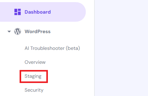
Finally, create the WordPress staging area by switching to the Staging tab and clicking Create staging. Enter your preferred subdomain and click Create.

How to Create a WordPress Theme
After setting up the staging area, follow these steps to create a WordPress theme from scratch using PHP, HTML5, and CSS3.
1. Create and Store the Template Files
Creating your own custom theme requires at least two templates. The index.php file displays content, while style.css manages the visual theme elements, like fonts.
However, most WordPress themes have additional template files defining the layout of specific website areas, like posts and pages. Here are some of the most common ones:
- header.php – contains HTML displayed on top of your WordPress website.
- footer.php – stores HTML that goes at the bottom of your website.
- sidebar.php – generates sidebar elements.
- functions.php – adds functionality to the theme, like WordPress widgets.
- single.php – displays a single post, including custom types.
- page.php – shows static content of a single page.
In this tutorial, we will use all these template files. Follow these steps to create them in the staging site:
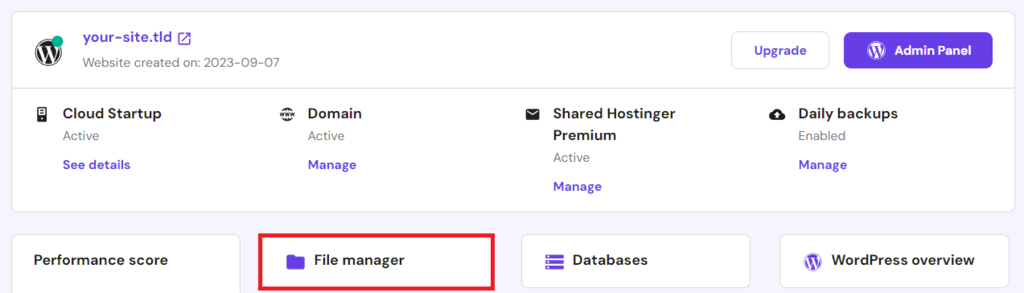
- Log in to hPanel and access your website’s File Manager.
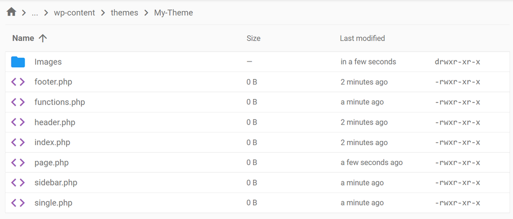
- Navigate to the WordPress themes directory by going to public_html → staging → wp-content → themes.
- From the sidebar, click New folder.
- Enter your theme name. It should be unique, short, and contain only alphanumeric characters without spaces. Click Create.
- Double-click the folder to open it. Select New File on the sidebar.
- Enter index.php and click Create.
- Repeat the previous two steps for all your template files. In this tutorial, we will create style.css, header.php, footer.php, functions.php, sidebar.php, single.php, and page.php.
These theme files should be in the same folder within the WordPress installation directory to allow the CMS to load these theme files based on the template hierarchy.
You won’t need all these custom templates if your entire website uses the same layout. However, we recommend using them to separate the main code from the additional content to simplify theme customization.
You also need to create JavaScript files in the theme directory if you want dynamic design elements. We won’t use them in this tutorial; instead, we will make a folder called Images to store visual assets like logos.
Currently, these theme files are empty. We’ll add the visual presentation first and set up the layout afterward.
2. Set Up the Initial CSS Stylesheet
After creating all the theme template files, we can start writing the code. Begin by adding details to the style.css stylesheet we made earlier to allow WordPress to recognize its content.
These details are information that will show up in the WordPress admin area, like the theme name, author, and description. They are written based on the WordPress file header formatting. Here is an example:
/*
Theme Name: My Theme
Author: Hostinger
Author URI: http://www.hostinger.com/tutorials
Description: My first responsive HTML5 theme
Version: 1.0
License: GNU General Public License v3 or later
License URI: http://www.gnu.org/licenses/gpl-3.0.html
*/
Important! If you wish to make your themes public, the last two lines about license information are mandatory. Otherwise, you can omit them.
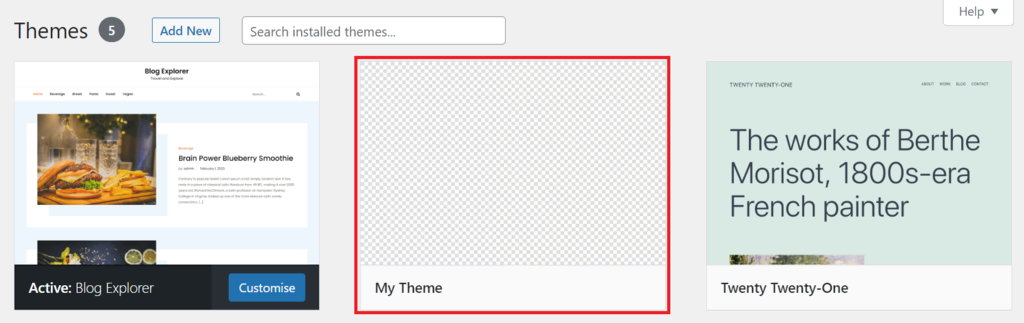
Click the disk icon on the top right to save the file. Now, return to hPanel’s website management menu → WordPress → Staging. Click Manage Staging on your test environment and select Staging Admin Panel.
Navigate to the sidebar → Appearance → Themes, and you will see the base of your theme.
Let’s add the visual design to make the theme more interesting. Open the stylesheet file and write your CSS code under the header. For example, we’ll add the following to change the background color:
* {
  box-sizing: border-box;
}
body {
    background-color: #f9f9f9;
    font-family: Helvetica;
}
Let’s break down the code to understand it. The snippet starts with an asterisk (*) to select all HTML elements and apply the styling within the first curly bracket pair. In this case, we add a CSS box model that houses the content, padding, and border.
Meanwhile, the second styling sets the background color and default font for all HTML content within the <body></body> tags.
Currently, you won’t see any changes since the HTML content is missing. We will include more CSS code after adding elements and building the theme’s structure.
3. Make the WordPress Theme Functional
Now that your WordPress theme shows up in the admin dashboard, it’s time to create the structure and functions. We will do so by adding code to the functions.php and sidebar.php files.
functions.php
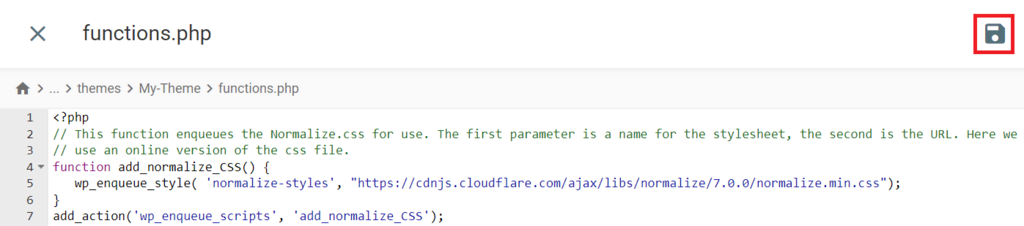
Due to inconsistent margins and padding settings, several web browsers might display your WordPress theme differently. To ensure it shows properly, link the normalize.css file to functions.php.
The normalize.css template is a premade stylesheet that provides a basis for your CSS code, allowing it to load consistently across different browsers. To add it, insert the normalization function into functions.php:
<?php
// This function enqueues the Normalize.css for use. The first parameter is a name for the stylesheet, the second is the URL. Here we
// use an online version of the css file.
function add_normalize_CSS() {
   wp_enqueue_style( 'normalize-styles', "https://cdnjs.cloudflare.com/ajax/libs/normalize/7.0.0/normalize.min.css");
}

add_action('wp_enqueue_scripts', 'add_normalize_CSS');
This code will prompt WordPress to pick the normalize.css file from the attached source URL.
Next, add a function to enable the widget area or sidebar. A widget is a modular extension that lets you add specific features to different sections of your WordPress website. To enable it, add the following after the previous snippet:
// Register a new sidebar simply named 'sidebar'
function add_widget_support() {
               register_sidebar( array(
                               'name'          => 'Sidebar',
                               'id'            => 'sidebar',
                               'before_widget' => '<div>',
                               'after_widget'  => '</div>',
                               'before_title'  => '<h2>',
                               'after_title'   => '</h2>',
               ) );
}
// Hook the widget initiation and run our function
add_action( 'widgets_init', 'add_widget_support' );
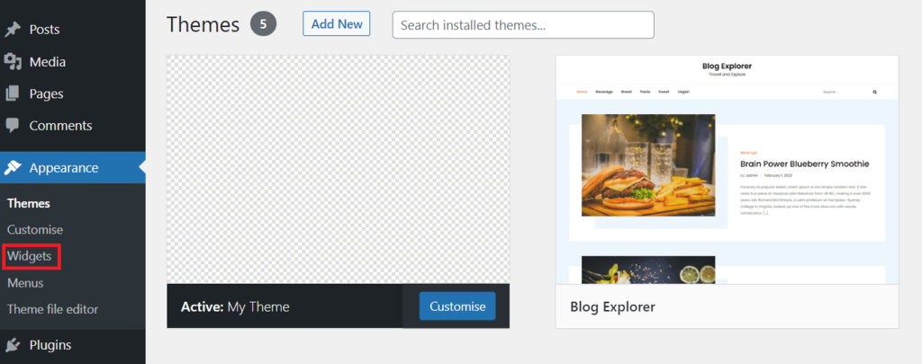
Now, let’s activate the theme by going to the Appearance → Themes and clicking Activate. You should see the Widgets menu under the Appearance tab, where you can add or remove widgets from your website.
The code contains an action hook – a PHP function that loads code from another file to modify WordPress settings and features without altering the core. We’ll discuss this terminology further in the later section.
Lastly, add the following code to enable the function for inserting a custom navigation menu:
// Register a new navigation menu
function add_Main_Nav() {
  register_nav_menu('header-menu',__( 'Header Menu' ));
}
// Hook to the init action hook, run our navigation menu function
add_action( 'init', 'add_Main_Nav' );
It will show the Menus button under the Appearance menu. Remember to save the changes by clicking the disk button in the File Manager code editor after adding new code.
There are various other functions to insert. For example, WordPress site owners commonly add a featured image and post thumbnails.
sidebar.php
Next, we’ll create the WordPress theme’s sidebar to display the widgets using the get_sidebar() function. Insert the code below into the sidebar.php file and save the changes.
<?php if ( is_active_sidebar( 'sidebar' ) ) : ?>
  <aside id="primary-sidebar" class="primary-sidebar widget-area" role="complementary">
    <?php dynamic_sidebar( 'sidebar' ); ?>
  </aside>
<?php endif; ?>
In the code, the if statement checks whether WordPress already displays a sidebar. If not, it will show the widgets you have added from the Widgets menu under the Appearance tab.
4. Build a Layout for Your Custom Theme
After adding the sidebar and CSS normalization functions, let’s create the layout of your WordPress theme. By the end of this step, the website structure will start to take shape.
In addition to index.php, we will modify the header.php, footer.php, single.php, page.php, and style.php files to give each web page a dedicated layout.
header.php
The header template file defines the top area of your web page. Start your code with the following:
<meta name="viewport" content="width=device-width, initial-scale=1.0">
The snippet allows the header of your WordPress custom theme to adjust its size automatically based on the screen size using responsive design. We’ll explain this concept in-depth later.
Next, add the following:
<!DOCTYPE html>
<html <?php language_attributes(); ?>
The DOCTYPE declaration tells the web browser the file type of your header template. Meanwhile, the language_attributes() function specifies HTML as the document’s primary coding language.
Then, add the <head></head> HTML tags, which contain the document metadata, like the web page title, default character set, responsive design viewport, and the linked stylesheet. All these details are enclosed with different tags.
<head>
<title><?php bloginfo('name'); ?> » <?php is_front_page() ? bloginfo('description') : wp_title(''); ?></title>
<meta charset="<?php bloginfo( 'charset' ); ?>">
<meta name="viewport" content="width=device-width, initial-scale=1.0">
<link rel="stylesheet" href="<?php bloginfo('stylesheet_url'); ?>">
<?php wp_head(); ?>
</head>
Next, we create the HTML document’s body section and use the body_class function to automatically assign a class to the <body> tag for styling.
<body <?php body_class(); ?>>
Add the header, which we will classify as the my-logo class. Then, we use <h1></h1> tags to show the logo in the Image folder as the main heading and anchor for the website’s URL.
<header class="my-logo">
    <h1><a href="<?php echo esc_url( home_url( '/' ) ); ?>"><img src="<?php echo get_template_directory_uri(); ?>/Images/logo.png" alt="Site Logo" width="50px" height="50px"></a></h1>
</header>
Lastly, add the following to insert a navigation menu in the theme’s header:
<?php wp_nav_menu( array( 'header-menu' => 'header-menu' ) ); ?>
index.php
The index.php file defines the homepage structure and serves as the default layout if other page templates are unavailable.
If you have different layouts for the header, sidebar, and footer, add the template tags to call their code into index.php. For example, use get_header to link the header, and so on.
To section your web page, use HTML5 semantic elements like <head> and <section>. If you want to apply the CSS stylesheet to them, add the class like the following:
<head class="class-name">
Important! Header tags can appear multiple times and don’t necessarily refer to the page header. Semantic elements should have a header if there’s text inside h1, h2, etc.
Here’s an example of code in the index.php file containing template tags and semantic elements:
<?php get_header(); ?>
<main class="wrap">
  <section class="content-area content-thin">
<?php if ( have_posts() ) : while ( have_posts() ) : the_post(); ?>
      <article class="article-loop">
        <header>
          <h2><a href="<?php the_permalink(); ?>" title="<?php the_title_attribute(); ?>"><?php the_title(); ?></a></h2>
          By: <?php the_author(); ?>
        </header>
        <?php the_excerpt(); ?>
      </article>
<?php endwhile; else : ?>
      <article>
        <p>Sorry, no posts were found!</p>
      </article>
<?php endif; ?>
  </section><?php get_sidebar(); ?>
</main>
<?php get_footer(); ?>
In the code above, we also added a WordPress loop – PHP code that retrieves posts from the database and passes them to other functions. It starts at <?php if ( have_posts() ) : while ( have_posts() ) : the_post(); ?> and ends with <?php endif; ?>.
The loop contains the following functions to retrieve specific details from the post:
- <?php the_permalink(); ?> – outputs the post’s actual URL.
- <?php the_title_attribute(); ?> – displays the post title in a format compatible with element attributes.
- <?php the_title(); ?> – shows the post title
- <?php the_author(); ?> – outputs the post’s author name.
- <?php the_excerpt(); ?> – extracts the post’s excerpt, which will be auto-generated if you don’t write one.
footer.php
The footer.php file defines content at the bottom of your theme, like copyright information or a sitemap. You can also add the <body> and <html> closing tags here if you haven’t specified them in header.php.
Define your footer content with the <footer></footer> HTML semantic element. For example, we will add copyright information at the bottom.
We’ll also add the wp_footer action hook to load the wp_footer function’s code in WordPress’ core or plugins’ files. Here’s how the complete code will look:
<footer>
<p>Copyright © 2024</p>
</footer>
<?php wp_footer(); ?>
</body>
</html>
single.php
The single.php file determines the layout of all post types in WordPress. In addition to blog entries, it defines custom post types like a product page on an online store.
Start the code by calling the header file using the get_header() function like the following:
<?php get_header(); ?>
Then, add the <section></section> tags to create the main container and assign a class for styling. Use a WordPress loop to retrieve the post content and display it using the_content() function.
If the post content isn’t available, we’ll display an error message. Here’s what the complete code will look like:
<main class="wrap">
  <section class="content-area content-full-width">
<?php if ( have_posts() ) : while ( have_posts() ) : the_post(); ?>
      <article class="article-full">
        <header>
          <h2><?php the_title(); ?></h2>
          By: <?php the_author(); ?>
        </header>
       <?php the_content(); ?>
      </article>
<?php endwhile; else : ?>
      <article>
        <p>Sorry, no post was found!</p>
      </article>
<?php endif; ?>
  </section>
</main>
<?php get_footer(); ?>
Unlike other template files, we don’t add the get_sidebar() function to omit the sidebar and widgets from all posts.
page.php
Areas like landing pages contain everlasting content that rarely changes. Instead of single.php, they will inherit the layout from index.php if dedicated page templates are missing.
We will use code similar to single.php but with several adjustments to distinguish website pages from posts. In addition to inserting a sidebar, we will make the content area smaller. Here’s how the code will look:
<?php get_header(); ?>
<main class="wrap">
  <section class="content-area content-thin">
<?php if ( have_posts() ) : while ( have_posts() ) : the_post(); ?>
      <article class="article-full">
        <header>
          <h2><?php the_title(); ?></h2>
          By: <?php the_author(); ?>
        </header>
        <?php the_content(); ?>
      </article>
<?php endwhile; else : ?>
      <article>
        <p>Sorry, no page content was found!</p>
      </article>
<?php endif; ?>
  </section><?php get_sidebar(); ?>
</main>
<?php get_footer(); ?>
Although we use the same loop, this code will iterate through pages instead of posts since we put it in the page.php file.
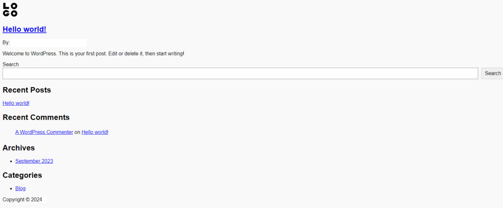
Currently, your custom WordPress theme has a layout and content. However, it will show plain text and a logo if you access the staging website since you haven’t added any styling.
Instead of opening PHP template files via File Manager, you can use File Theme Editor to add or modify their code. Access it from the Appearance menu in the WordPress admin dashboard.
5. Improve Your Design on the CSS Stylesheet
After adding the HTML elements and assigning them classes, return to your stylesheet to customize their design. Begin by adding the following into style.css to modify the logo’s size, padding, and color:
.my-logo,
footer {
  width: 100%;
  padding-left: 1%;
  margin-bottom: 8px;
  background-color: #78baff;
  border: 1px solid #78baff;
}
Then, add the following to style sections in your theme layout. We’ll customize the h1 anchor, article, and footer:
body > header > h1 > a {
  color: #ffffff;
  font-weight: 400;
}

article > header {
}

footer {
  margin-top: 4px;
}

a {
  text-decoration: none;
}

/* 'Margin: 0 auto' centers block content on the page */
.wrap {
  width: 99%;
  margin: 0 auto;
}
Lastly, assign the styling to other elements like the content area and sidebar by adding the following code snippets:
.content-area {
  display: inline-block;
}

.content-thin {
    width: 70%;
}

.content-full-width {
    width: 100%;
}

.content-area,
.primary-sidebar {
  display: inline-block;
}

.primary-sidebar {
  width: 25%;
  padding: 1%;
  vertical-align: top;
  background-color: #ececec;
}

.article-loop {
    width: 45%;
    text-align: left;
    margin: 5px;
    padding: 10px;
}

.article-full {
  width: 99%;
  padding: 1%;
}

.article-loop,
.article-full {
  display: inline-block;
  vertical-align: top;
  background-color: #FFF;
  border-radius: 4px;
  margin-bottom: 4px;
}
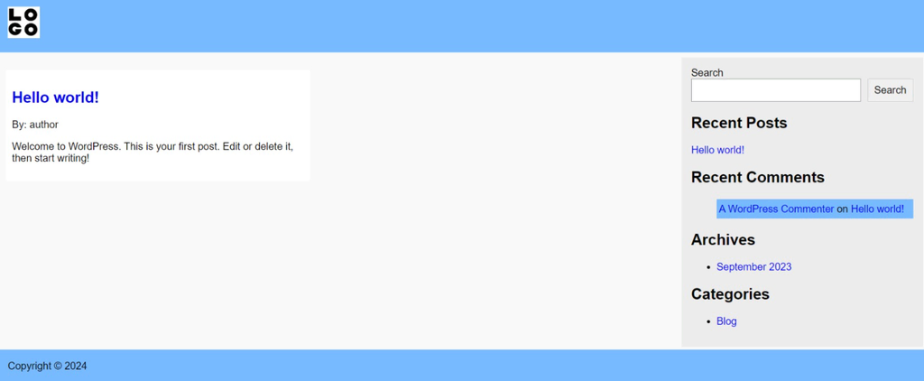
Once you apply your new theme, your staging website should look like this:
To modify the stylesheet, you can add WordPress custom CSS via the theme editor. Access the feature by going to Appearance → Themes → Customize → Additional CSS on the sidebar.
Important! Since we are developing a classic theme, you can’t use WordPress Full Site Editing by default. Use a theme builder plugin to customize it.
6. Test and Deploy Your Theme
Before deploying your new custom theme, let’s activate it in your staging WordPress site to check if it displays and works properly.
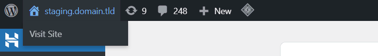
Go to your staging area admin dashboard and activate your new theme via the Themes menu. Then, access the test website by clicking the Visit Site button at the top of the admin bar.
After checking the visual appearances and layouts, deploy the theme into your live site. To do so, return to the staging area’s File Manager, click your theme folder, and select the download button on the top bar. Download it as a ZIP file.
Extract the folder to your local computer and upload it to your live site’s /wp-content/themes directory via File Manager. Activate the theme via the WordPress admin dashboard.
Essential Concepts in WordPress Theme Development
After creating your own theme, you might want to modify its features and appearance later. To help you get started, we will explain essential design and functionality concepts in WordPress theme development.
Media Queries and Responsive Design
Website visitors’ screens vary in resolution, size, and orientation. If you only develop the theme for desktop, it won’t display and function correctly on other devices like mobile phones.
Applying responsive design ensures your theme works properly regardless of the screen size. It lets the website adjust its layout, content placement, and element sizes automatically by detecting the devices’ display type.
To enable responsive theme design, add CSS media queries to define the content presentation when the viewport alters. They use percentages to determine the layout and size relative to the screen.
For example, each section in the two-column theme design will always occupy 50% regardless of the resolution and orientation. There are several CSS properties for media queries, but some of the common ones are:
- max-width – defines the maximum width of the browser’s viewable area.
- min-width – determines the minimum width of the visible area.
- orientation – checks whether the screen is in a portrait or a landscape mode.
We recommend adding the media queries at the bottom and assigning classes for cleaner code organization and simpler theme customization.
For instance, add the following media query to automatically adjust the size of the previously created theme’s main content and sidebar:
@media screen and (max-width: 400px) {
  .content-area,
  .primary-sidebar {
    width: 80%;
  }
}
This rule applies to screens and browser windows with a maximum width of 400 pixels. The selected elements, namely content-area and primary-sidebar, will show 80% of their original size if the viewport is within the specified dimension.
You might need additional rules for other screen sizes and orientations to ensure your content always displays correctly. For instance, set a condition when the content shows at 100%:
@media screen and (max-width: 800px) {
  .content-area,
  .primary-sidebar {
    width: 100%;
  }
}
Template Tags
Template tags are PHP functions that let you easily link files and simplify complex database queries. Instead of writing long code, WordPress developers can achieve such tasks using a single line of script.
To apply a template on a specific page, add the tag to the corresponding file. For instance, to show the footer only on the home page, add get_footer at the bottom of home.php and not page.php.
While some tags are optional if you don’t use the template file, others are essential to ensure WordPress loops work correctly. They retrieve post information from the database, allowing the loop to iterate and pass the data.
To link a template file, here are some of the most commonly used tags:
- get_header() – includes the header.php template.
- get_sidebar() – calls the sidebar.php template.
- get_footer() – links the footer.php template.
- get_search_form() – includes the searchform.php template.
Meanwhile, the following template tags display information from the WordPress database:
- bloginfo() – displays information requested in the parameter, such as bloginfo(“name”) that shows your website’s name.
- single_post_title() – presents the title of the currently viewed post when used in the single.php file.
- the_author() – shows the author of the currently viewed post.
- the_content() – outputs the main text of a post or page.
- the_excerpt() – displays an excerpt of any posts or pages.
WordPress Loop
A WordPress loop is code that iterates through posts, retrieves their data, and passes it into other functions. Its basic functionality is fetching content from the database and displaying it to the front end.
In WordPress theme development, the loop is essential for displaying posts dynamically. Otherwise, you are limited to static content since your template files don’t have the latest information from the database.
The loop goes into the index.php file and other templates that display post content. It always starts with the if statement, like the following:
<?php if ( have_posts() ) : while ( have_posts() ) : the_post(); ?>
Then, specify the template tags, HTML, or PHP functions to modify the retrieved data if it exists. For example, use the_content() to show a single post’s full content or the_excerpt() to list the shorter version.
In our previous page.php, we display the page information as the main content using the following code:
<article class="article-full">
        <header>
          <h2><?php the_title(); ?></h2>
          By: <?php the_author(); ?>
        </header>
        <?php the_content(); ?>
      </article>
The WordPress loop ends with the else statement, specifying the condition to apply if the queried data doesn’t exist. For example, it will show an error message:
<?php endwhile; else : ?>
   <p><?php _e( 'Sorry, no pages matched your criteria.' ); ?></p>
<?php endif; ?>
Action Hooks
Hooks are PHP functions that let you manipulate the default WordPress feature without editing the core files. Depending on the purpose, there are two types of hook – action and filter.
Filter hooks are used to modify existing code in function.php and output the altered data to the user. Meanwhile, the action ones are for creating new functions that run at a specific time.
In addition to the core files, you can use hooks to attach functions from WordPress plugins to your theme. It ensures compatibility between different software in the content management system (CMS) environment for optimal stability.
Moreover, hooks let you organize your code in separate files to simplify modifications, updates, and debugging. You can also use them to add more features, like enabling the built-in WordPress customizer or site editor for block themes.
In our newly created theme, we use an action hook in the header.php file to fetch the default WordPress HTML header and insert it in your code:
<?php wp_head(); ?>
 </head>
Meanwhile, the following wp_footer() action hook in your footer template includes WordPress’ default code and run functions defined in plugins:
  <?php wp_footer(); ?>
  </body>
</html>
If your theme doesn’t include hooks, important source codes won’t load, and plugins won’t function correctly. For example, a missing wp_footer() might disable the WordPress admin bar since it is attached to the action hook.
Creating a WordPress Theme Best Practices
To ensure your WordPress theme performance and integrity, consider the following best practices during development:
Validate Your Theme Code and Files
Check your new theme to ensure it adheres to the latest WordPress review standards. In addition to verifying its functionality, code validation helps catch issues that might affect security, compatibility, licensing, and quality.
The easiest way to do so is by using a plugin like Theme Check. We recommend running the test regularly after making changes to quickly catch potential problems.
Test Your Theme on Different Devices and Browsers
To ensure your WordPress theme’s media query rules work correctly on different viewports, access the website on different devices.
You can simulate different screen sizes using your web browser’s device toolbar. Google Chrome users can access it by pressing Ctrl + Shift + C and then Ctrl + Shift + M. Adjust the resolution and aspect ratio from the top bar.
In addition to testing on different devices, test your WordPress theme on other web browsers since they might render CSS and HTML differently, leading to errors that can hurt the user experience.
Leverage a Theme Template
Use a starter theme to simplify the development process. Instead of writing code from scratch, you only need to add additional styling and features based on your needs.
A theme template usually adheres to WordPress coding standards, providing a robust base theme for your development. Some also have a large community support and knowledge base for easier troubleshooting.
Since there are many starter themes, we recommend a free one from a reputable developer like Astra and Underscores.
Minify and Optimize Your Code
When building WordPress themes from scratch, keep the code clean to reduce the file size. It allows web browsers to render your theme more quickly, ensuring optimal website speed.
To further improve the page load time, use tools like Minifier to reduce the size of your PHP, CSS, and JavaScript files. This process removes additional characters that don’t affect the code functionality, like whitespaces.
Before minifying your code, back up the original files since the result might be difficult to read, complicating debugging or maintenance.
Also, create child themes – sub-themes that let you add new functions or styling without affecting the main template files. They help prevent misconfigurations and allow you to revert changes easily.
Conclusion
Creating a custom WordPress theme from scratch allows you to make your website more unique and personalized. You can choose only the necessary features, minimizing code bloat to improve page load speed.
In this article, we have explained how to create your own theme for a WordPress website from scratch. After setting up a staging area, follow these steps:
- Create index.php, style.css, and other template files in your staging area’s theme folder inside the WordPress themes directory.
- Set up the initial CSS stylesheet by adding the theme developer information and background color.
- Make your WordPress theme functional by adding a sidebar in the functions.php and sidebar.php.
- Build your WordPress theme layout by sectioning the index.php and other template files using HTML tags.
- Improve your theme design by adding CSS to each class via the stylesheet.
- Test your custom theme on the staging area and push the files to the live environment once finished.
Apply the responsive design to your WordPress theme to ensure it displays properly across all screen sizes. Also, configure the template tags, WordPress loops, and action hooks correctly to maintain compatibility with other software within the CMS.
How to Create a WordPress Theme FAQ
To help deepen your understanding, this section will answer several commonly asked questions about how to make a WordPress theme.
Is It Hard to Create Your Own WordPress Theme?
It depends on the complexity of the theme you want to create. A basic WordPress theme requires at least two files written in HTML, CSS, and PHP. A feature-packed one is more complicated due to extra programming languages and code. Instead of writing code from scratch, use a basic structure from an existing WordPress theme to make the process easier.
Can You Make Money From WordPress Themes?
Yes, there are various WordPress community marketplaces for selling your own themes, like ThemeForest and CodeCanyon. On average, premium theme developers sell their products at $59 per license.
How Long Does It Take to Build a WordPress Theme?
It takes around two weeks or more, depending on the complexity and features. If you’re a beginner, it’s normal to require more time since you’re also learning web development as you go.

Liam is a WordPress fanatic that loves to write about web development and coding. When he's not working, he likes to help people create websites and applications. In short, his job is also a hobby!

Aris is a Content Writer specializing in Linux and WordPress development. He has a passion for networking, front-end web development, and server administration. By combining his IT and writing experience, Aris creates content that helps people easily understand complex technical topics to start their online journey. Follow him on LinkedIn.

Comments
September 12 2018
Hi Liam, Clear tutorial. Just one (minor) thing: You are not triggering/executing the add_normalize_CSS function. So adding that to functions.php is quite useless now. ;-)
April 21 2019
Really useful post especially for the beginner. Thanx a lot.
August 27 2019
Thanks much to you for such an awesome blog. Thanks for your valuable information about wordpress theme. Feel free to visit to know more information about best premium wordpress themes and wordpress theme So Please Visit Our Website: https://www.beingwp.com/
November 28 2019
It such a wonderful post to read, thank you for sharing experience and ideas. The facts have been discussed are really important, keep up the good work
December 05 2019
well worth a read, got great insights and information from your blog. Thanks!
June 20 2022
Does this custom theme work with full site editing? If I use Gutenberg to make changes will they be saved to the theme?
July 14 2022
Hey there! All WordPress themes can be edited with the Gutenberg editor, and with Full Site Editing being integrated into Block Themes, you would be able edit the custom themes ?