19 Best Information Websites For Inspiration in 2024
Information websites are knowledge hubs that present tailored content to inform visitors about specific topics, services, or products. They distribute knowledge via various formats, such as articles, blog posts, videos, and infographics, all of which address the readers’ key questions.
A well-structured informational website can also function as an excellent sales tool, engaging and educating both potential and active customers. For instance, our Tutorials section focuses on educating readers on all aspects of web hosting, website creation, and maintenance.
This article aims to inspire future information website creators by showcasing 19 exceptional websites developed using Hostinger Website Builder.
The information websites have been carefully chosen for their standout qualities in mobile compatibility, efficient web design, easily navigable content, quick loading speeds, simple navigation, and visually appealing color schemes.
Download website launch checklist
Top 19 Information Websites
We evaluated six key factors when compiling the list of the top informational websites:
- Mobile compatibility. We assessed how well the informational websites performed on mobile devices.
- Efficient web design. We evaluated the overall design of the informational sites for their aesthetic appeal and user-friendliness.
- Ease of navigation. We checked the simplicity and intuitiveness of navigating the websites, focusing on the speed and ease with which information could be located.
- Content quality. We looked at how well the content communicated relevant information, including the use of engaging multimedia elements.
- Loading speeds. We measured the responsive loading times for all information websites.
- Visual appeal. We also considered the color schemes and overall visual presentation.
Let’s delve into the top informational website examples built using Hostinger Website Builder.
1. Believing in Footprints Inc.
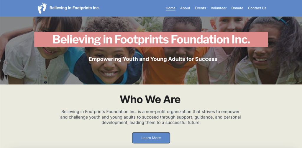
This informational website is dedicated to showcasing the impact of volunteer work and social change. It features a clean, user-friendly design, emphasizing easy navigation and engaging content.
The site uses visually appealing images and a well-structured layout to highlight the stories and experiences of volunteers. Key features include a prominent call-to-action, a blog section for detailed stories, and integration of social media links.
The website includes a dedicated Volunteer section, inviting visitors to participate in volunteer activities, fostering a sense of community and involvement. Additionally, it has a prominent Donate section, enabling visitors to contribute financially to the cause.
2. Shark Education Club
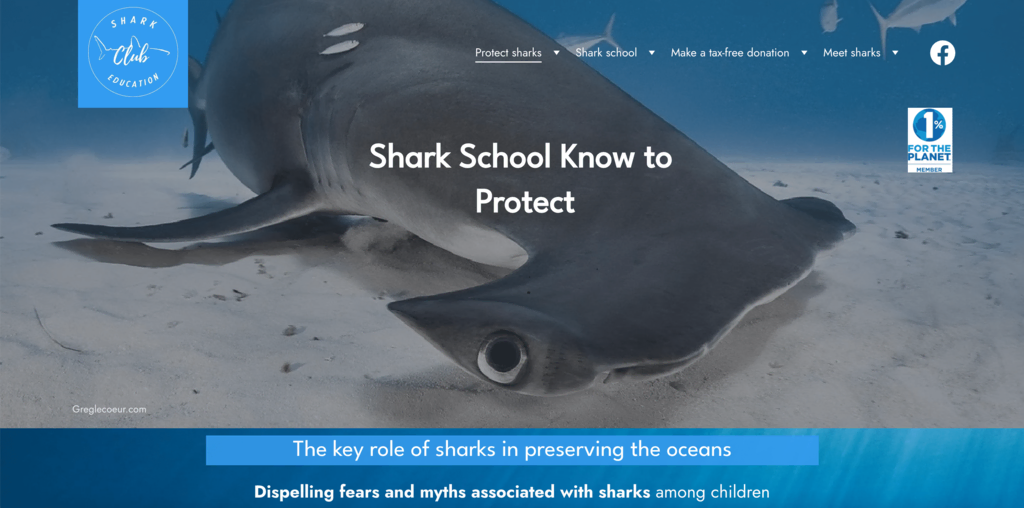
This French information website is dedicated to shark conservation awareness, featuring a dynamic design that emphasizes visual storytelling through images and informational content.
The website’s hero section introduces its shark conservation theme with a striking image of a hammerhead shark and a headline focused on conservation. Its sticky header features a custom logo and a menu bar that enhances navigation for visitors, allowing them to visit another page as they browse. It also has a dedicated donation section where visitors can make their contributions to the conservation efforts.
One standout feature of the website is the Shark School. It provides information on the children’s awareness program, the training program for becoming a shark facilitator, a gallery, and a section about the program’s creators.
3. AGRUS DATA
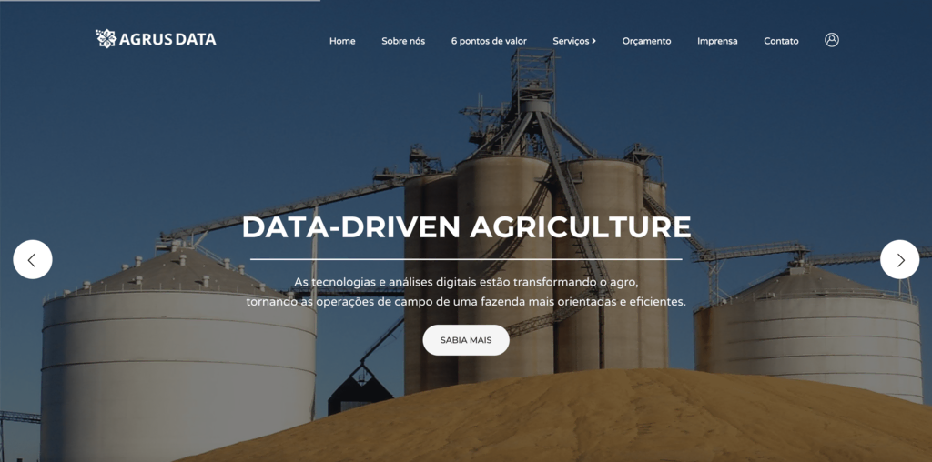
This information website focuses on data analysis to transform agricultural practices, helping producers reduce costs through IoT (Internet of Things). It makes great use of parallax scrolling and uses the hero slider functionality to provide quick insights into data-driven agriculture, with each snippet paired with a CTA that gives readers more details.
The site’s opaque header showcases a custom logo and menu bar with links to key web pages. Its layout uniquely sections Home, About Us, and 6 Points Of Value on one page, while Services, Budget, Press, and Contact have their own dedicated pages.
4. James Nader Photography Education
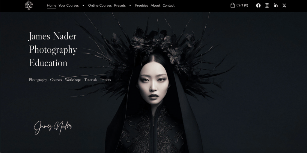
This professional website focuses on photography education and workshops. The site features a sophisticated and modern landing page, appealing primarily to creative professionals and photography enthusiasts.
The owner effectively utilizes the website’s homepage as an organized portfolio, showcasing work and providing detailed information about workshops, courses, and presets.
The site’s color palette of black, grey, and white works to further accentuate the featured images. Additionally, it uses a clear navigation system with a sticky header that includes social media icons, enhancing user engagement and ease of access.
5. Edubem
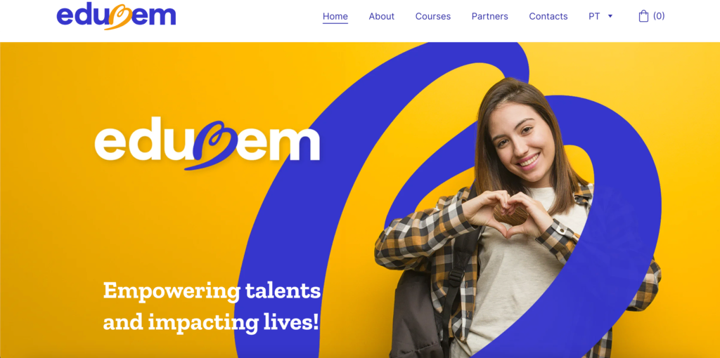
This Portuguese informational website, managed by a non-profit association, is dedicated to making quality education accessible by eliminating financial barriers. The organization uses a unique social compensation model that allows students to volunteer at partner organizations, earning course discounts or free access in return.
The site’s design is straightforward and user-friendly, highlighted by a custom banner featuring the association’s logo and tagline. A call-to-action section below the hero image invites the target audience to explore courses, volunteer, or become partners. The courses page presents the courses in a grid layout accompanied by a CTA that gives details about each course.
6. Education Action in Crisis
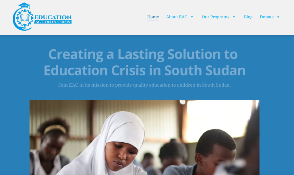
This informational website, run by a youth-led NGO, is dedicated to addressing the ongoing education crisis in South Sudan. It primarily focuses on areas impacted by conflict and displacement.
It visually aligns with humanitarian efforts through its UNICEF-like blue color scheme. The hero section highlights the NGO’s mission. A sticky header facilitates easy navigation, while the footer provides the NGO’s registration number for authenticity verification and social media icons for further engagement.
Additionally, the site also features a dedicated page for informational blogs that delve into various aspects of the educational crisis.
7. Fast Task
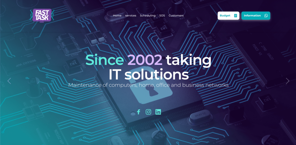
This is a great informational website example, showcasing how businesses can leverage a single-page layout to create a compelling website. The site effectively uses a clean, modern design with parallax scrolling, enhancing the visual appeal and user engagement. The hero section used social icons as CTAs to lead visitors to the firm’s social handles.
Its layout is straightforward, providing visitors with all necessary information in a single, fluid scroll. The website features a custom logo that aligns well with its branding, reinforcing its professional image.
The use of a single-page design is complimented by a sticky header that further simplifies navigation. A stand-out feature is the SOS section, which allows visitors to seek IT support from the firm without having to deal with a ticketing service.
8. ILCI Business School Paris
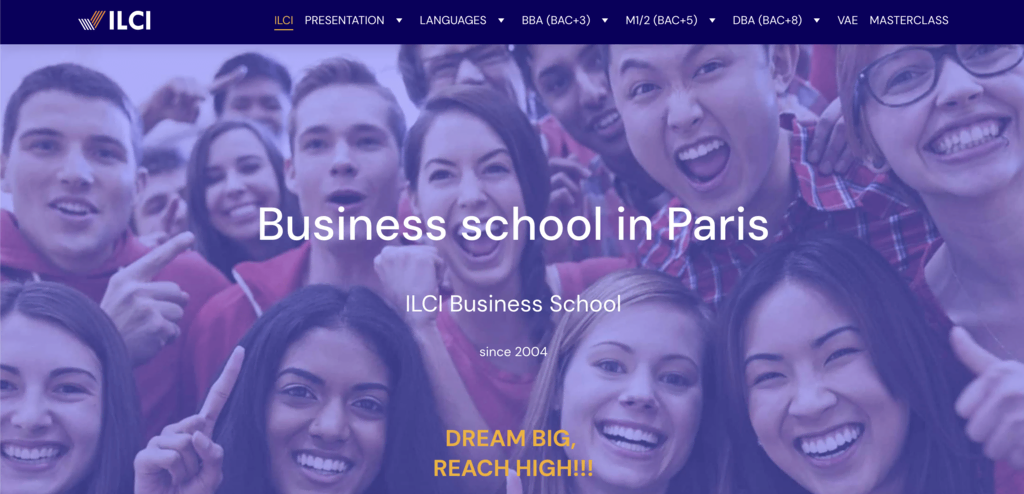
This educational website showcases a French business school in Paris. The site features a polished and professional design that highlights its academic offerings. It provides detailed information on various courses, catering to both domestic and international students.
The hero section displays a banner with images of students and includes two separate CTAs for enrollment – one in English for international students and another in French for local students. The homepage also displays compelling statistics about the institute. An embedded map in the footer provides the school’s location, helping applicants locate the premises.
9. HelpUp
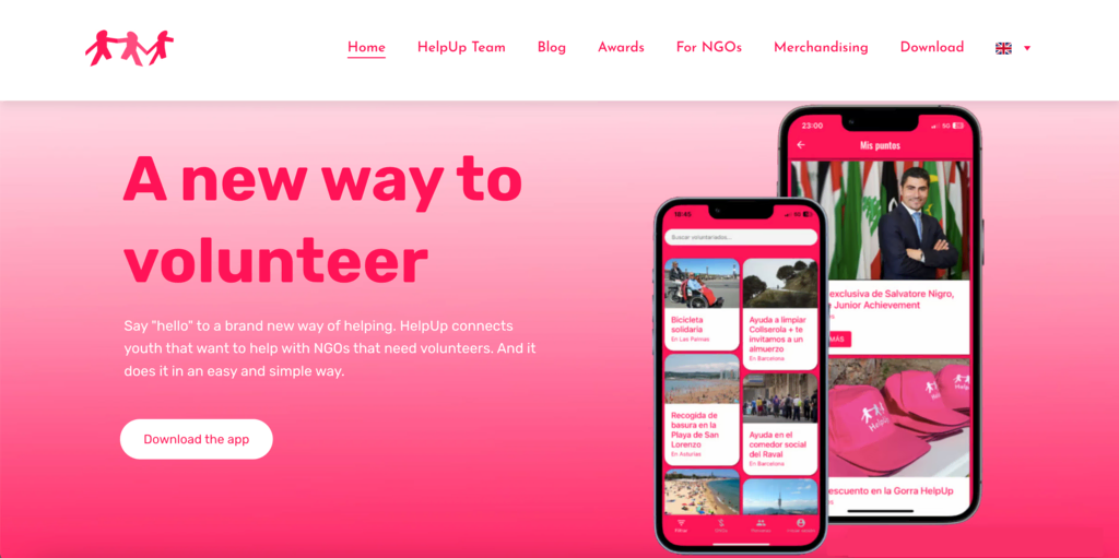
This informational website connects young volunteers with NGOs needing assistance in Spain. The site is complemented by a smartphone app where volunteers earn points for their work and exchange them for rewards.
The landing page displays a smartphone image, a download CTA for the app, and a clear statement of purpose. The site makes effective use of whitespace to display content and information without overwhelming the reader.
A key feature is the translation button, offering content in Spanish or English, catering to the region’s English-speaking community. Additionally, the site also contains a merch store where volunteers can redeem points and visitors can make purchases.
10. PEdu
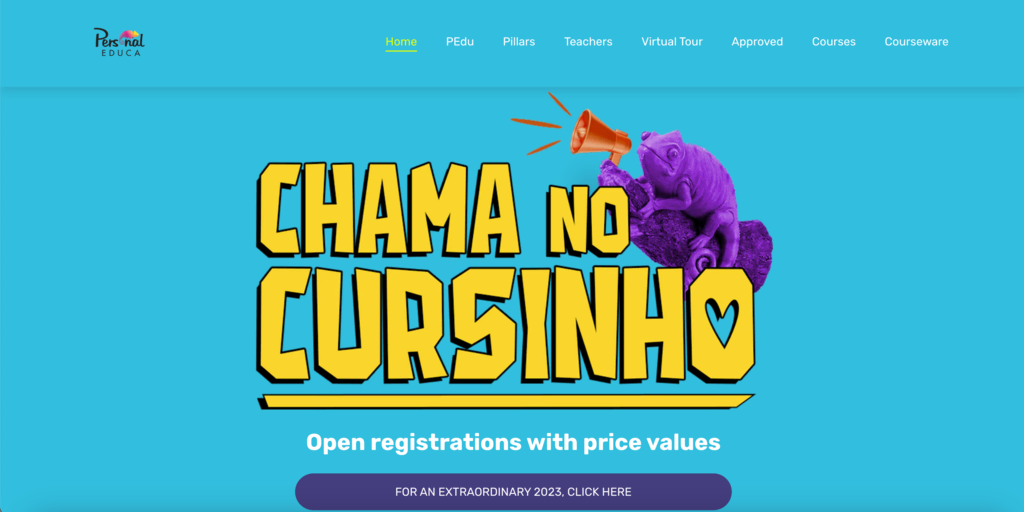
This Brazilian website offers educational content and resources, including courses and training programs, for personal development.
The website’s layout allows for single-page browsing or navigating to specific sections via the menu, offering a versatile user experience. Its quirky design features bright colors, graphics, and fonts, aligning with the initiative’s vibrancy and the mindset of the pre-university students it targets. The site utilizes video testimonials in the review section to promote its courses.
A unique feature is the CTA in the hero section, directing visitors to contact PEdu via WhatsApp for direct communication.
11. Telepati
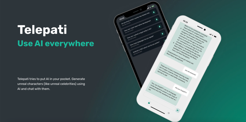
This is a great example of how app developers can create informational websites for their products. It focuses on a mobile application that incorporates ChatGPT AI technology into a user-friendly chat interface.
Designed for a single app, the website effectively uses a single-page layout to detail all features. Opting to forego a traditional header for a larger hero section, it provides multiple CTAs below this section, guiding visitors to various app stores for downloading the app. Additionally, the website employs a responsive design, ensuring optimal content display on smaller screens.
12. Tecnored Redutores
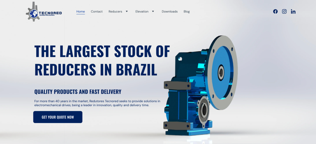
This is an information website of a company with over 40 years of history in electromechanical drive systems.
The site content focuses on the firm’s commitment to quality, innovation, and timely delivery, featuring an extensive range of products through an interactive catalog. Potential customers can click on the products featured in the catalog to visit their details section on a separate page.
The hero section features a product and a compelling headline asserting market authority, coupled with a CTA for quotes. Additionally, the site includes a downloads section for product catalogs, manuals, and other reliable information sources, enhancing the user experience for existing and potential customers.
13. NSIQ INFOTECH
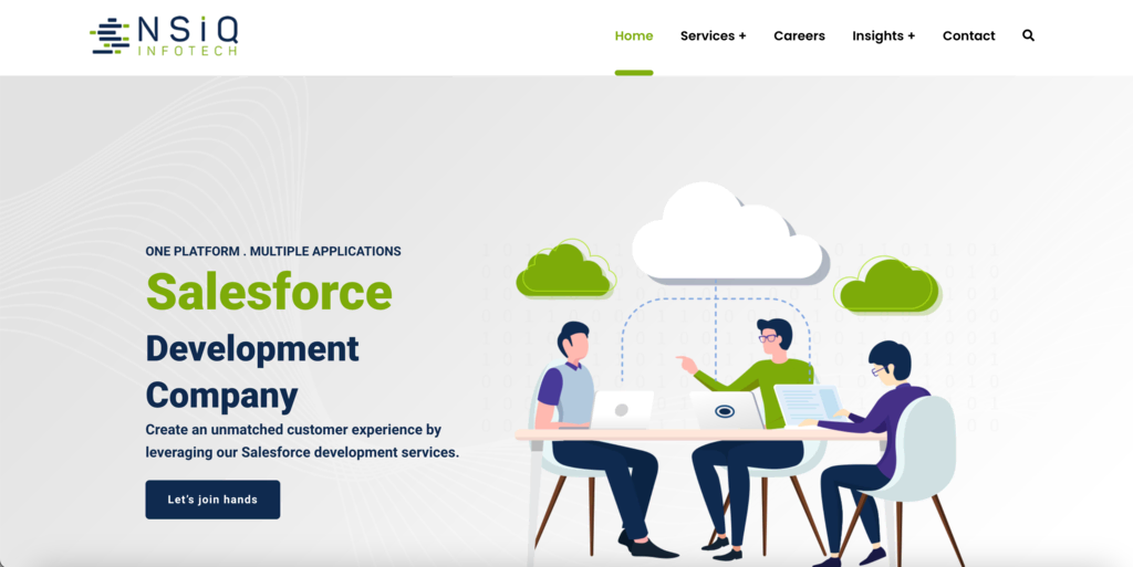
This website showcases a company specializing in Salesforce development services. It employs primarily 2D visual elements, with minimal reliance on images.
The homepage includes an interactive catalog of services offered, with detailed information available upon clicking individual services. To facilitate navigation in the content-rich site, the header menu is made sticky and includes a search bar, making it easier for users to find specific information. When clicked on, the search bar takes up the whole page, giving users a clutter-free experience.
Additionally, the site features an ‘Insights’ section, providing access to informative blogs about Salesforce and case studies that demonstrate the company’s expertise in the field.
14. Positive Education
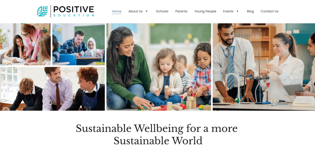
This is an educational website that focuses on the benefits of positive psychology in education. The website’s hero section uses a carousel element and a tagline that highlights the organization’s initiatives.
The positive education blog uses a grid layout to provide enlightening, data-driven articles, actionable advice, and motivational narratives on positive education. The site uses a sicky header to ensure easy navigation. The menu bar uses dropdown lists for some items to give visitors access to a broader range of options without overwhelming the main interface.
15. YC Education Group
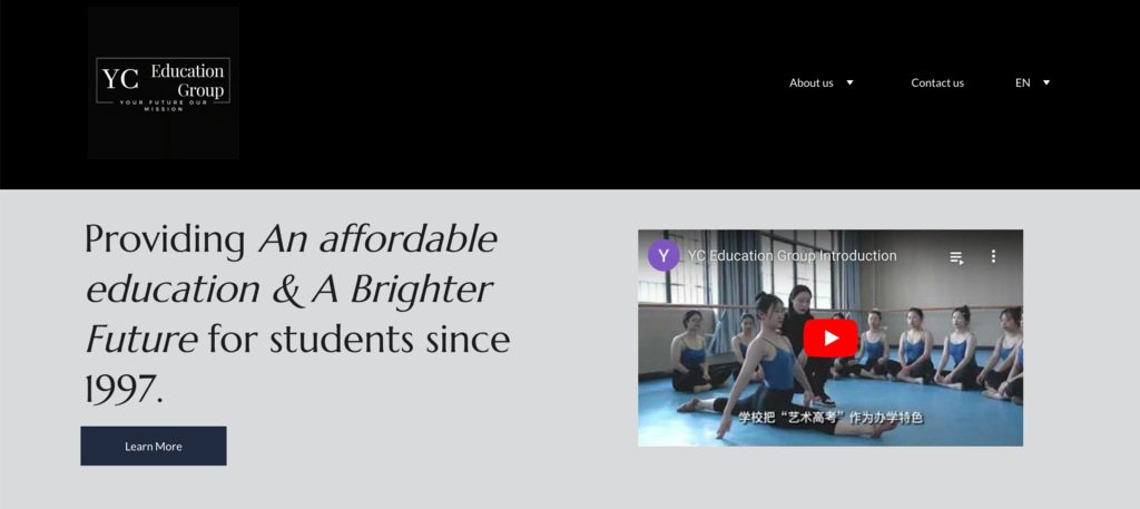
This information website belongs to a school that has been bringing affordable education to students in China and Malaysia since 1997. The homepage features a compelling school trailer within an embedded YouTube player and a call-to-action leading to the About Us page.
The Contact Us page is equipped with a detailed form and an integrated map, facilitating easy communication with admission counselors. The site’s design employs a harmonious three-tone color scheme and offers a language picker for Mandarin or English, enhancing accessibility for a diverse audience.
16. RUGAS
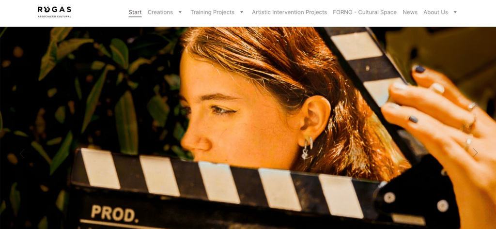
This website belongs to a cultural organization based in Sintra, Portugal. The website The homepage features a carousel element that displays images from the events it has hosted.
The site uses the section below the hero to give visitors information about upcoming events and previous creations. The two-tone color scheme keeps things simple and ensures that there is ample whitespace that gives visitors a clutter-free browsing experience.
Suggested Reading
Check out our article if you need more inspiration to create an event website.
17. Rally da Educação
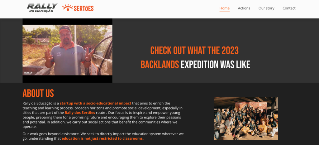
This information website belongs to a socio-educational initiative in Brazil, focusing on enhancing teaching and learning processes through innovative and practical actions. The homepage features a detailed infographic that highlights the institute’s accomplishments.
The site features an Instagram feed that displays images from the institute’s Instagram handle and encourages visitors to connect with the social handle. The website makes great use of video elements to get information across through a video format and avoid overcrowding the web pages with text content.
It also makes navigation easier with a sticky header and a mobile-friendly website layout that scales elements perfectly to different screen sizes.
18. Stornoway
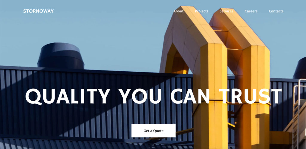
This information website belongs to a construction company in Stornoway, Scotland, highlighting their expertise in commercial, industrial, and residential construction. The site features a succinct layout, offering easy access to their portfolio, including prominent projects.
The website’s design is streamlined for professional presentation, with clear navigation to detail their services and career opportunities. The site also provides an intuitive navigation bar, and a clear contact information section that is complemented by an interactive map. Additionally, the website is bilingual, offering content in both German and English to cater to a wider audience.
19. ZAZÓN Studio
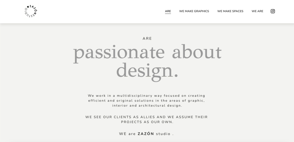
This information website belongs to a graphic and interior design studio and is a sleek showcase of its multidisciplinary design services.
The minimalist aesthetic, combined with a clean, modern typography and a monochromatic color scheme, reflects the studio’s creative philosophy. The site has a unique and engaging portfolio display, where it divides graphic and interior design projects into two, dedicating individual web page layouts for both.
A sticky header compliments the straightforward navigation and the seamless Instagram integration on the homepage offers a glimpse into the more recent projects. The website emphasizes visual storytelling, helping the studio get more clients by showcasing its capacity to transform spaces and concepts into tangible art.
What to Include in an Information Website
When creating an information website, there are several key elements to consider to ensure a user-friendly experience:
Clear Navigation
A well-structured menu and navigation system is crucial for guiding visitors through your site. Content should be organized into logical categories and subcategories, with descriptive labels for menu items.
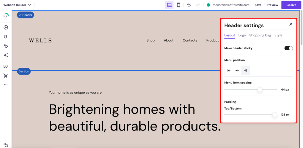
This can be easily achieved with Hostinger’s site maker, which simplifies the process of creating an intuitive navigation menu. All our templates come with a pre-built navigation bar inside the header. You can further use the builder’s customization capabilities to change the header and the menu bar to your preferences.
The Header settings tab, accessed through the Edit header option, allows you to change the header layout, logo, and style. You also have the option to make the header sticky, which is one of the important web design best practices to follow for content-heavy websites.
Since information websites are content-heavy, they often need to implement drop-down menus to organize content more effectively. With Hostinger Website Builder, you can easily add drop-down menus to your navigation bar by going to Pages and navigation, clicking on the settings icon next to the page, and selecting the Move to dropdown option.
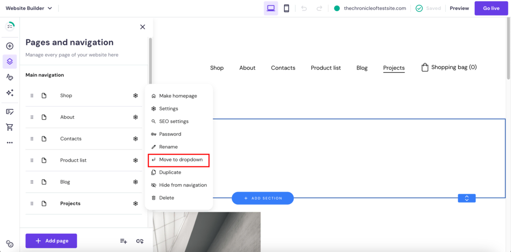
Selecting this option will immediately make that page a sub-page of the page that’s above it in the list. To nest the sub-page under some other page, you can simply drag and drop it below the intended page.
High-Quality and Engaging Content
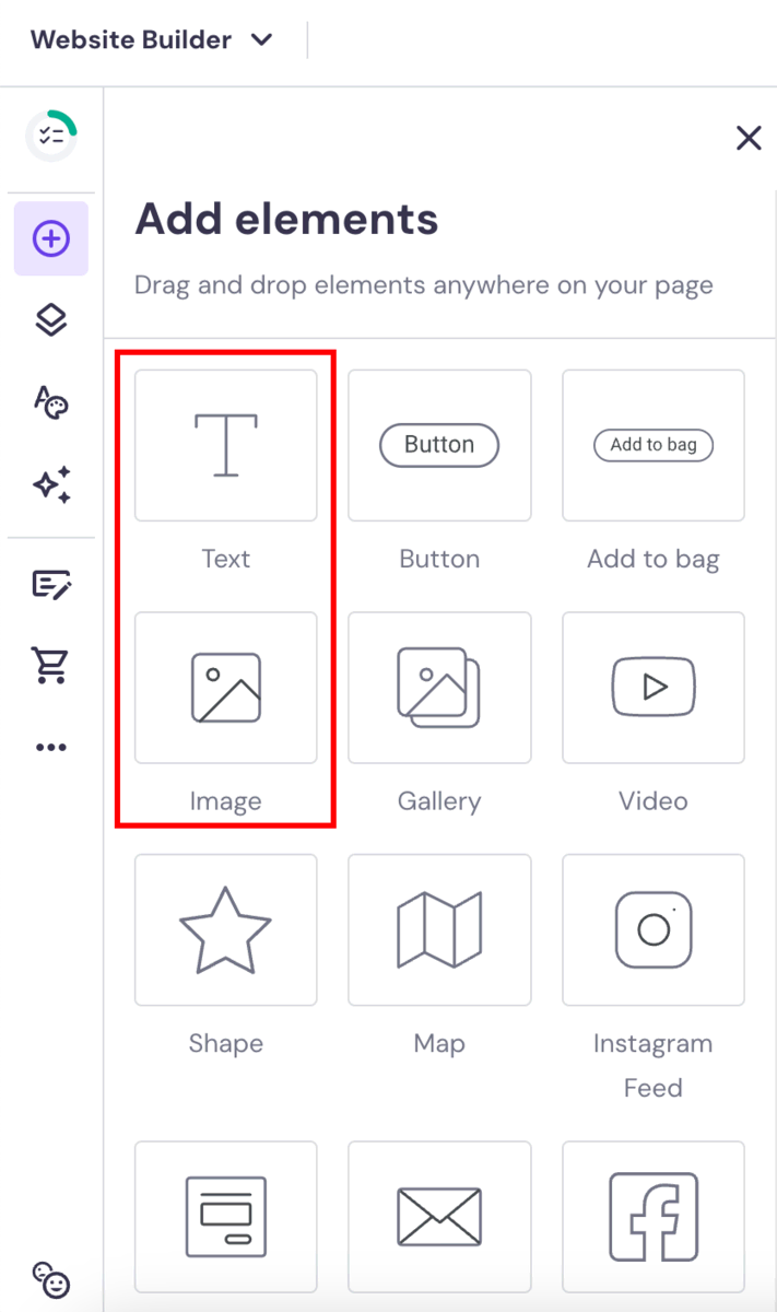
The content of your information website should be informative and engaging to retain visitors. Use concise, clear language and incorporate multimedia elements like images, videos, and infographics to enrich your content.
Hostinger Website Builder supports these needs by offering tools for adding and formatting informative content seamlessly. You can add images by going to Add elements and selecting the Image element. Similarly, for text, you can select the Text element.
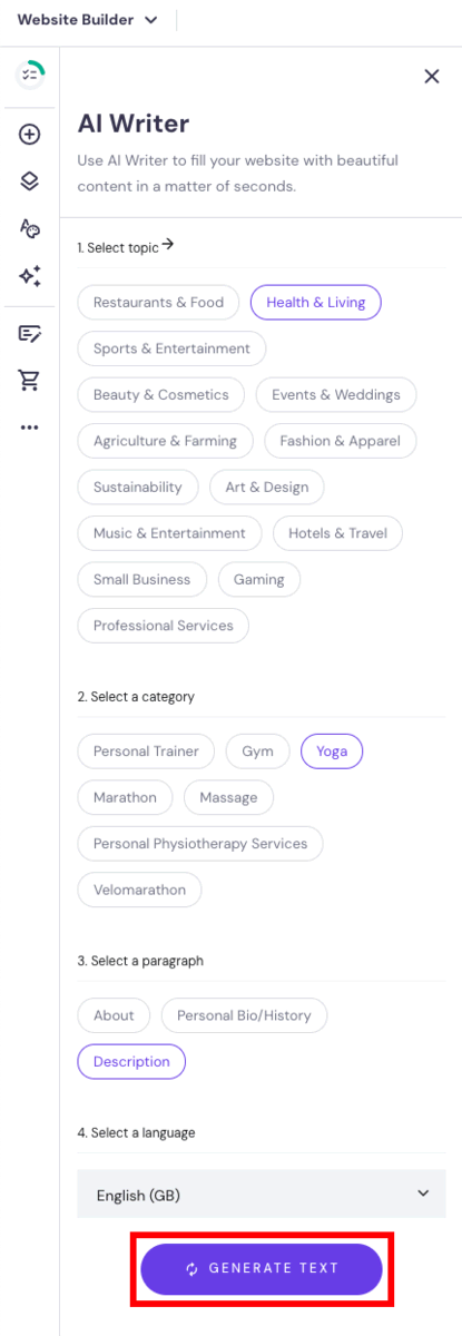
Hostinger Website Builder also offers users AI tools to help with content creation. The AI Writer creates unique, SEO-friendly content copy for your website. All you need to do is specify the topic, category, paragraph, and language.
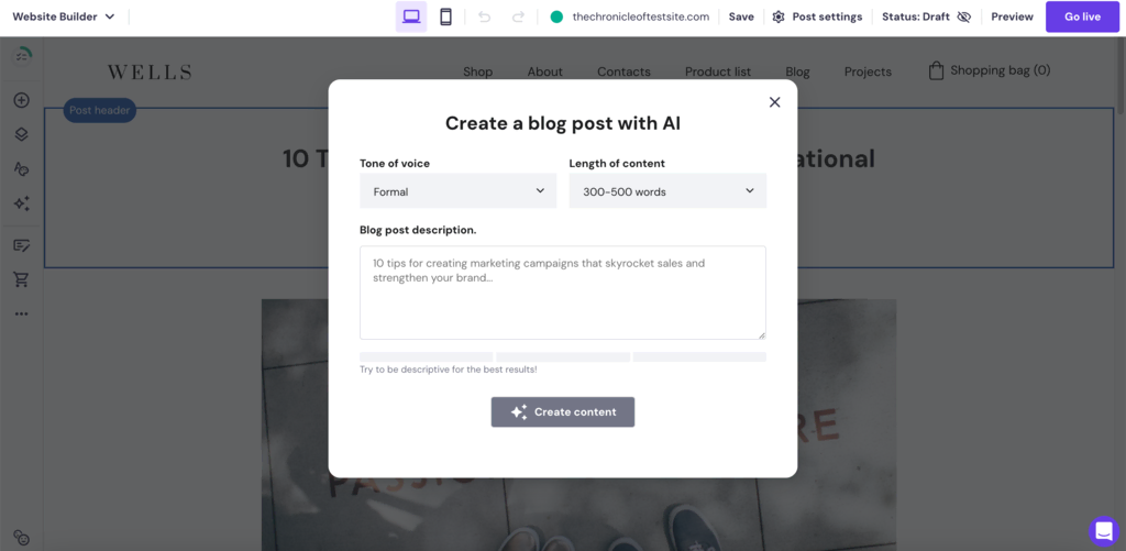
Meanwhile, the AI Blog Generator is designed to take prompts from you to write a complete blog post on the topic from scratch.
Contact Information
Include clear contact information to make it easy for users to reach out with inquiries. Adding a contact page can greatly enhance user interaction, providing a channel for feedback and questions.
Hostinger Website Builder allows for easy integration of a contact page, enhancing the functionality of your informational site.
To create your own contact page, go to Pages and navigation → Add page → Contact and select a contact template from the options.
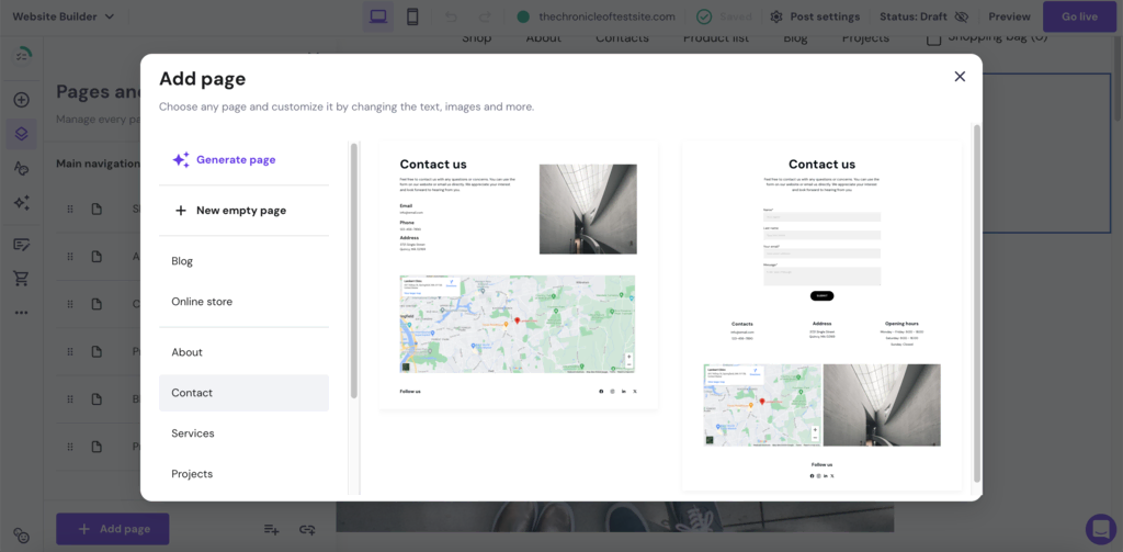
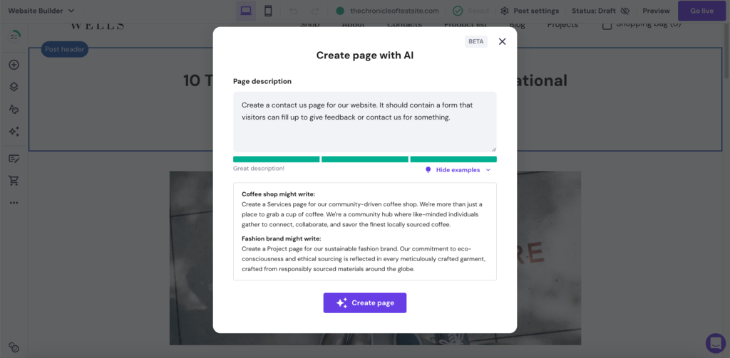
Alternatively, you can also use our AI Page Generator to have the tool create a contact page for you from scratch. Just describe the page you have in mind.
Social Media Buttons
Social media integration is crucial for extending the reach and engagement of your website. Link your information website to your social media profiles to build a more connected online presence.
Hostinger Website Builder offers options to add social icons, facilitating easy connection between your website and social media channels.
You can add social links on your websites by going to Add elements → Social icons.
Accessibility Features
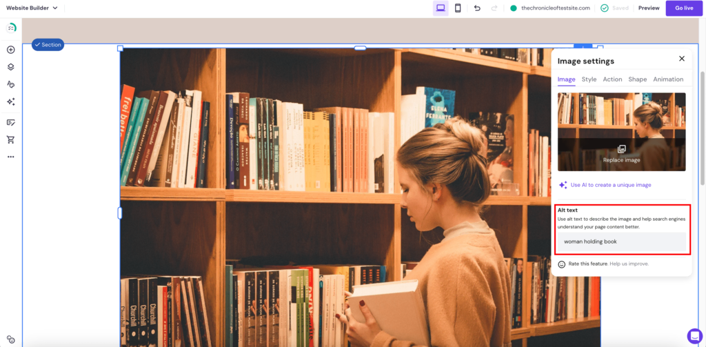
Focus on delivering an accessible and inclusive experience when designing your website. It ensures that your website caters to all users. Implementing features like alt text for images and proper HTML markup are important for accessibility.
Hostinger offers the best website builder in the market when it comes to accessibility. All 150 Hostinger Website Builder templates are designed with accessibility in mind, following the Web Content Accessibility Guidelines (WCAG) set by the World Wide Web Consortium (W3C).
You can also add alt text to images by selecting the image, clicking on Edit image, and adding an alt text inside the Image tab.
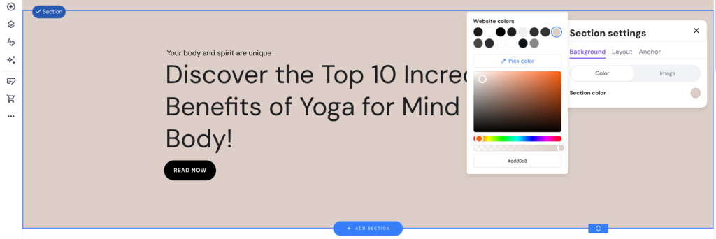
To customize further, use our color picker tool that can change colors on the fly, making it easy to create accessible information sites.
Conclusion
An effective information site is more than just the sum of its parts. It’s about creating a space that resonates with users, provides valuable content, and establishes a strong digital presence.
Here are three stand-out examples of information websites from the list:
- ZAŻÓŃ Studio. With its minimalist design and visual storytelling.
- Tecnored Redutores. Demonstrating effective use of information to establish industry authority.
- Shark Education Club. Driving home a powerful conservation message by educating generations.
As you focus on building your own information website, the examples illustrated in this article highlight that with the right approach, your website can be an inspirational and influential cornerstone for your audience or business in 2024 and beyond.

Akshay is a Senior Content Writer who loves writing about technology. As a Computer Engineering graduate and a certified digital marketer, he aims to make tech easier for everyone. He also enjoys cooking, traveling, and learning new languages. Follow him on LinkedIn.