Best Church Website Examples: Inspirational Designs + Top Tips
Nowadays, even a traditional church can benefit from establishing an online presence. A great church website can improve its image, showcase its values, offer a digital resource center, and promote events.
Most importantly, besides helping existing church members, such a website can attract new believers.
With this in mind, our experts have selected the 20 best church websites based on design, functionality, and visitor engagement for your inspiration. We’ll also highlight each site’s Best Design Elements to find out what makes them stand out.
Finally, we’ll provide top tips for creating great church websites.

Top 20 Church Website Examples
Without further ado, here are the best church websites to take inspiration from:
Suggested Reading for Building a Church Website
How to Make a Website
Website Cost
How to Design a Website
25 Best WordPress Church Themes
1. Passion City Church
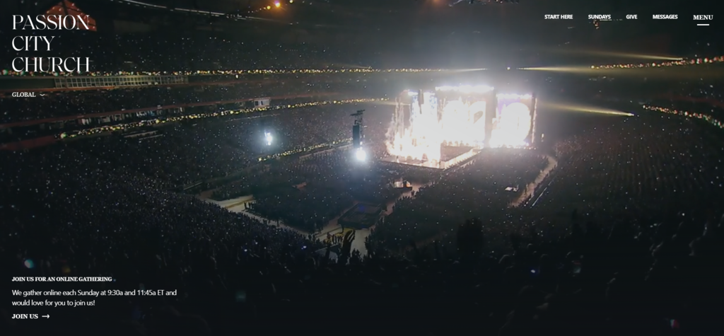
This site follows one of the main church website design trends – using a good background video on the homepage to draw visitors’ attention.
Furthermore, this church website has a visually appealing design with bold fonts, lively imagery, subtle animation, and plenty of white space. It is particularly important for church websites to create an uncluttered look.
The website also encourages visitors to make donations, download the pastor’s podcast, and register for events.
Best Design Elements:
- Start Here page – Passion City has a dedicated page for new joiners, detailing everything they need to know about the church’s values and Christianity.
- Catchy menu – this church site displays the menu clearly through large fonts and a background video that changes based on the mouse cursor’s location.
- Resources page – its Passion Originals page features all the church sermon videos organized into topics, series, and dates.
2. Renewal Christian Centre
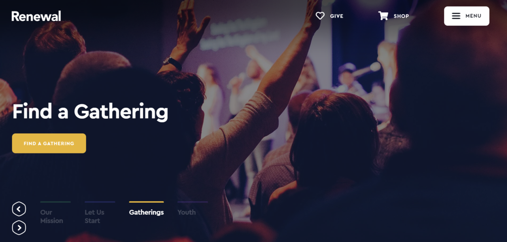
Renewal Christian Centre’s homepage immediately catches visitors’ attention with a scrolling banner that highlights important announcements. The navigation menu is well-organized, making it easy to find information about different programs and church services.
Additionally, this church provides information about each of its branches across England and Wales on dedicated pages that are easy to navigate.
Best Design Elements:
- Pages’ transitions – smooth transitions between pages and menu items make the website appear more dynamic.
- Contact form – a complete contact form on the bottom of the homepage makes it easier for visitors to drop a message.
- Service location and schedule – site visitors looking for quick information about the time and place of service can easily find it on the homepage.
3. Flatirons Community Church
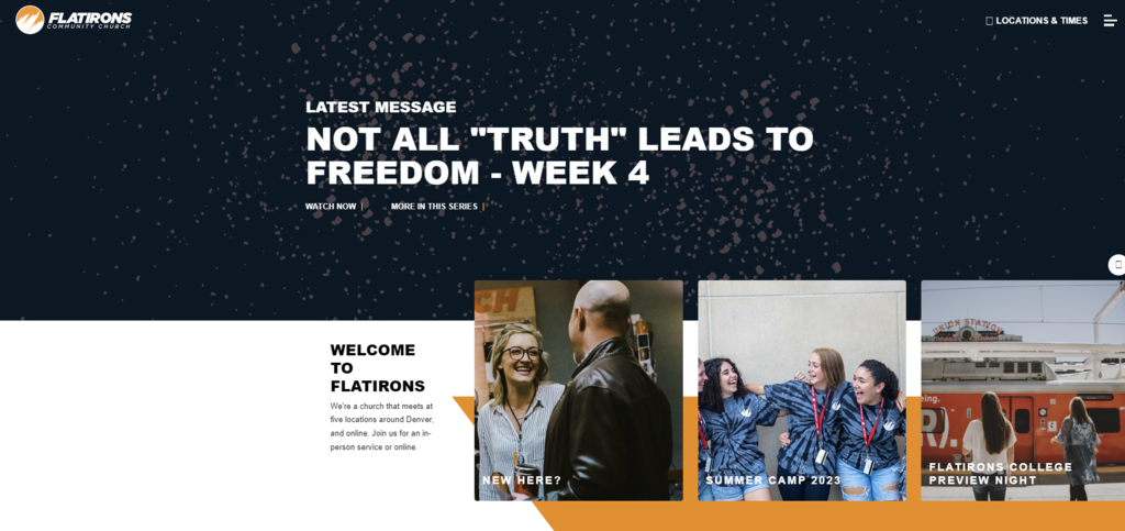
Like other great church website examples, Flatirons Community Church uses several elements, such as a background video with a catchy title in the center, smooth scrolling transitions, and a consistent color palette.
Additionally, each ministry has its own page, featuring a calendar, a resource list, good-quality pictures, and videos. On top of that, it provides a search bar to help find information easier.
Best Design Elements:
- Bold accent color – the orange accent adds a pop of color to the church site, which is useful for highlighting information.
- Subtle animations – adding scroll or cursor-triggered animations helps engage visitors and highlight important information.
- Full-screen menu – clicking the hamburger menu leads to full-screen navigation covering all Flatirons Community Church content pieces. This is an eye-catching and efficient way to deliver information.
4. Cedarcrest Church
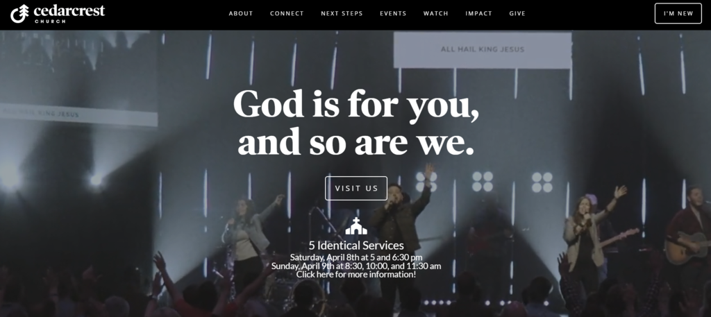
Like many church websites in this list, Cedarcrest also uses a nice background video on the homepage. The clear call-to-action (CTA) in the center of the homepage can also engage visitors.
By scrolling down the homepage, users can easily learn how to get involved with the church. They can read about church values, history, and sermons, as well as find guidance for new believers.
Best Design Elements:
- I’m New button – this button on the homepage’s top right shows information about joining the church.
- Clear worship service information – this site displays the church location and schedules for service immediately on the homepage’s midpoint.
- Menu headline – every menu has its own eye-catching headline, such as there is a place for you at Cedarcrest, on top of the page.
5. Hillsong Church
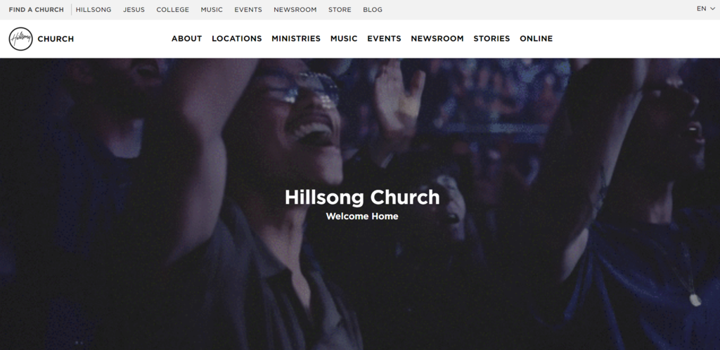
Hillsong is a globally famous Christian church known for its music. Its website displays the world map showing all church locations worldwide. As for website design, its smooth transitions make the site appear lively.
The church website has an extensive menu, with each drop-down menu providing a detailed list of the church’s different ministries, music groups, services, and locations. This makes the site easy for visitors to navigate.
Best Design Elements:
- Music new releases – Hillsong showcases its latest worship music releases with uniquely designed pages featuring videos, lyrics, merchandise, and links to listen on Spotify and Apple Music.
- Trending songs – visitors can easily find popular songs by checking out the most searched ones in the last thirty days.
- Jesus page – it explains who he is and what he represents in a clear and concise manner. This is excellent for connecting with new visitors or curious individuals.
6. Elevation Church
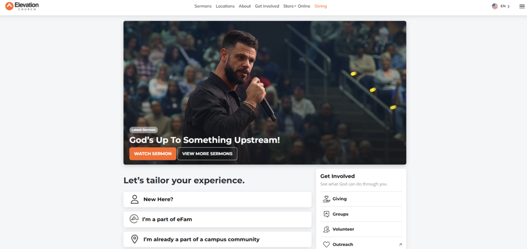
The website of Elevation Church has a sleek and modern look, heavily focusing on visual content. The homepage also has a large video background that displays a sermon, and the site features many high-quality photographs that demonstrate the church values and mission.
Moreover, the website uses a simple design, bright colors, and large buttons to motivate visitors to participate and engage with the church.
Best Design Elements:
- Tailored experience – this website offers different content based on users’ involvement with the church – new ones, online joiners, or members.
- Latest sermon – displaying the latest sermon upon landing on the homepage is a good way to get visitors to know your church.
- Useful hamburger menu – the three-line icon on the homepage’s top right shows a menu for the whole church website, which is an effective way to improve navigation.
7. Faith Church
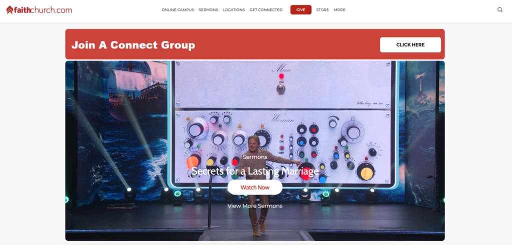
Faith Church’s website is user-friendly, with an organized menu and proper spacing. The red and white color palette looks good and helps highlight important details like service times and events.
Visitors can easily find the latest sermon video and connect with the church’s social media accounts. Its menu is also well-organized, making finding information about the church easy.
Best Design Elements:
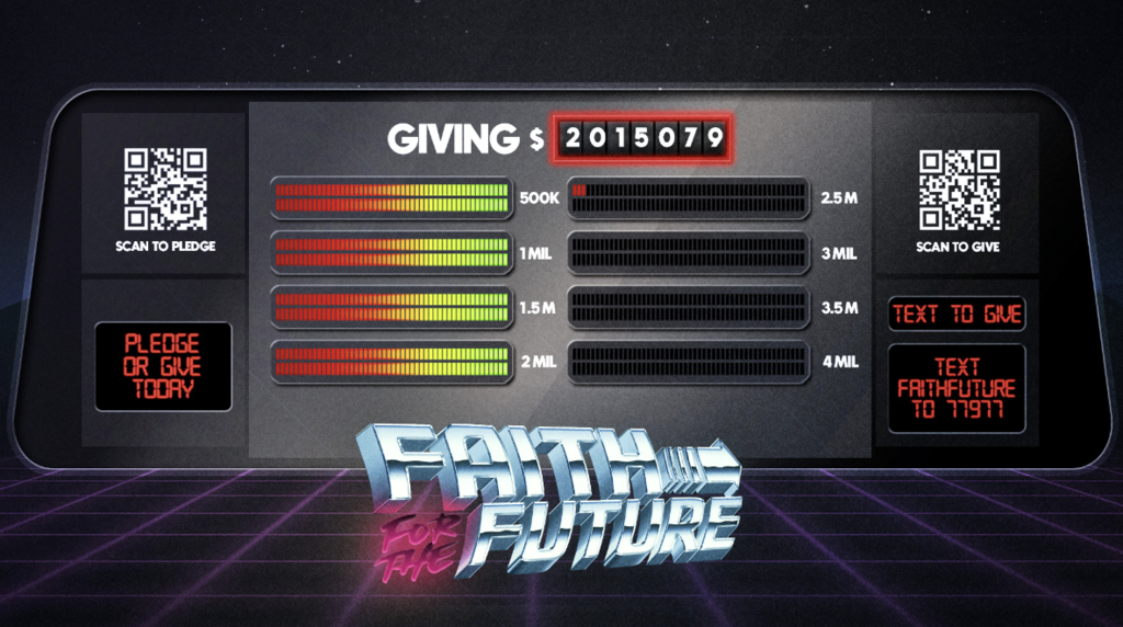
- Unique design – Faith Church has unique and creative themes to showcase its latest events. For example, the Faith for the Future initiative uses a 1980s retro theme visible on each page’s elements.
- Prayer CTA – a clear and concise Need Prayer? banner leads visitors to a prayer request form.
- Detailed side menu – the church lists its various ministries on the side menu based on age groups, making it easy for visitors to find relevant information.
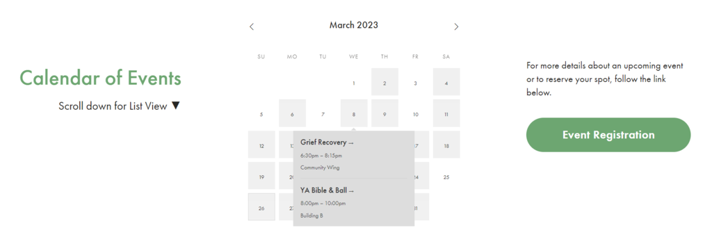
8. The Sanctuary
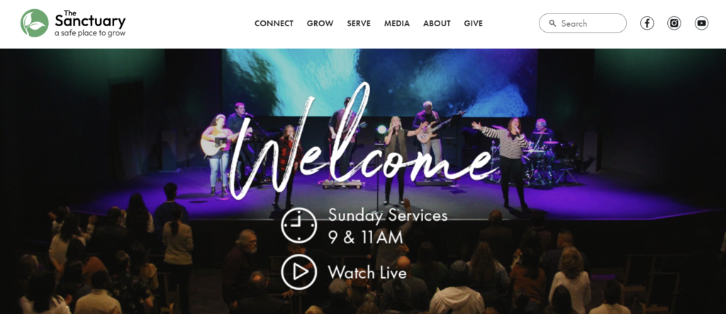
The Sanctuary church website is user-friendly – any site visitor can find what they need quickly because the navigation is straightforward. The website also has attractive photos that grab visitors’ attention. Furthermore, visitors can also search for specific information using the search bar.
It displays social media links on the homepage so that visitors can easily start following them. Moreover, the website has a detailed menu that provides information about the church’s activities, events, and programs.
Best Design Elements:
- Clear menu items – you can find a list of menu options describing the church’s activities and programs, with a section for newcomers. The menu is divided into For You and For Your Family to make it easier to navigate.
- Featured events – displaying featured events on the homepage with their time and brief descriptions can increase visitors’ interest in attending.
- Events calendar – in addition to highlighting events on the homepage, it also has an event calendar, making it easy to find specific information.
9. Valley Creek Church
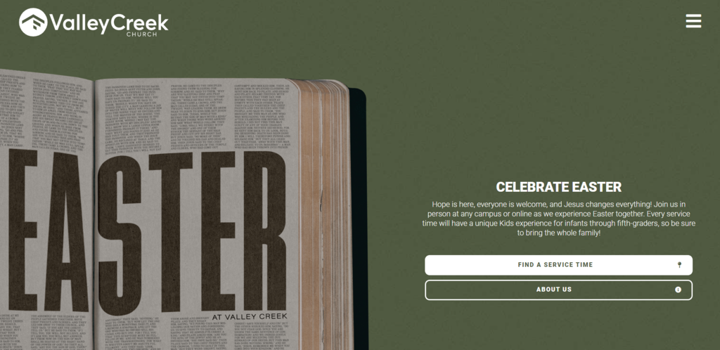
This inspiring church website is user-friendly and easy to navigate. The homepage has a modern design with clear buttons to take action, making it easy to find worship services’ times, locations, and events.
It also has resources for members and newcomers, such as sermon archives and online giving. The whole website is informative and stylish, with a bright color palette, helping attract more site visitors.
Best Design Elements:
- Detailed location menu – its attractive location menu displays a map, campus staff list, contact form, and frequently asked questions (FAQ).
- Smooth transition – the site displays a zig-zag transition as the homepage loads, adding a dynamic feel.
- Easy resource navigation – this church also owns ValleyCreek+, a secondary site that contains resources like Bible reading plans, sermon recordings, and self-help videos.
10. 121 Community Church
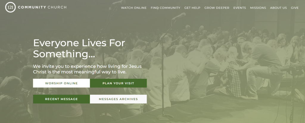
121 Community Church has a simple and modern homepage design with a big image and a clear button for visitors to plan their visits. The navigation menu is also user-friendly, showing users information about Sunday gathering times, locations, and ministries.
The website also provides resources for members, such as sermon archives, online giving, and an FAQ list. Its clean and uncluttered design with subtle animation makes it comfortable to browse.
Best Design Elements:
- Plan Your Visit button – creating a page specifically for new joiners can encourage them to visit the church in-person.
- Color palette – the consistent white and green palette across the website is important, as people most likely judge a website based on the color within the first 90 seconds.
- Comprehensive resource menu – the extensive resources menu of this church is organized by topics and includes both internal and external sources.
11. The Orchard
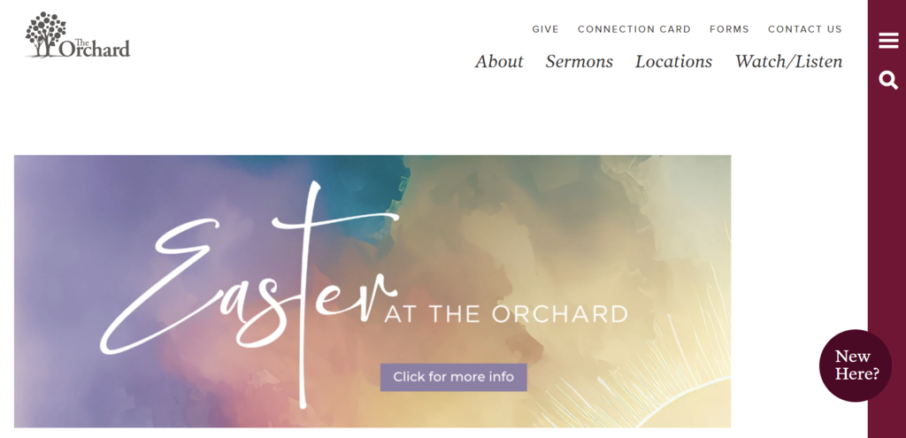
Despite having lots of content, The Orchard Church website is uncluttered and clean. The top and hamburger menus are straightforward, making it effortless for visitors to find information.
The consistent use of serif fonts throughout the website gives it a professional and trustworthy appearance. The ample white space and the cohesive color palette also make the website more attractive.
Best Design Elements:
- Locations’ pages – if your church has multiple locations, creating a dedicated page for each place with a unique URL helps with local search engine optimization (SEO).
- Church leaders list – showing the leaders on a church website enhances transparency and fosters community engagement.

- Button for newcomers – placing a prominent New Here? button on the homepage that leads to a detailed guide is an effective way to reach out to new visitors.
12. Bayside Church
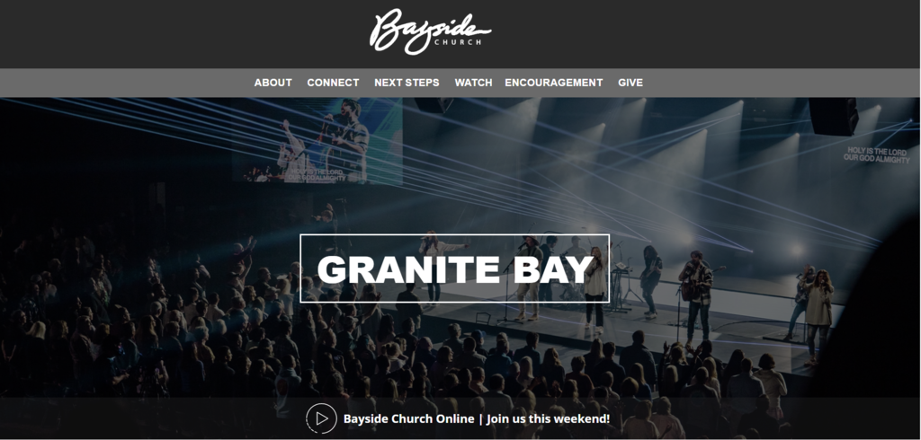
Bayside Church has a detailed drop-down menu under the logo that simplifies finding information on the church’s various locations and programs. Additionally, the website offers various resources, such as devotionals and links to external tools, making navigation effortless.
Furthermore, the church’s core values are creatively displayed in an acrostic-style poem, adding an interesting element to the site.
Best Design Elements:
- Bible verse of the year – this church provides verse of the year’s resources, including pictures for social media and wallpaper for your devices, all easily downloadable.
- Brief event descriptions – the homepage displays the church’s events, giving visitors a clear idea of their purpose and intended audience, making it easy to find a suitable program.
- New to faith page – putting a page dedicated to new believers is a good way to engage with the community and add important resources.
13. CenterPoint Church
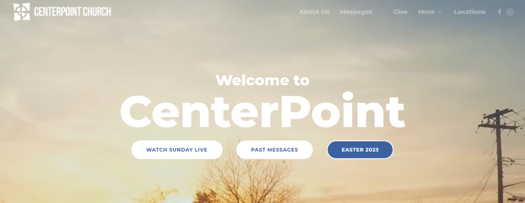
Like many churches on the list, CenterPoint Church uses a large background video on its homepage, including ambience videos alongside church activities. This church displays large and clear CTA buttons throughout the site to engage visitors.
This site has various content, but it’s displayed in an organized and uncluttered way, so navigation is effortless. Additionally, the consistent use of a blue-and-white palette makes this site more appealing.
Best Design Elements:
- Bulletin board – including a bulletin board with announcements from church members may help you engage with the community.
- Messages page – CenterPoint Church has a complete sermon page, organized based on the release date. As a result, it’s easier to find a specific message.
- Resources page – in addition to the sermon page, this church also compiles all its resources in one place. They’re also grouped based on various topics, such as finance, marriage, or discipleship.
14. Cherry Hills Community Church
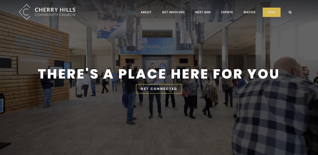
Cherry Hills Community Church has a visually attractive design with a search bar and a navigation menu that simplifies information search. The layout is well-structured, featuring upcoming events, service times, and highlighted content.
It also provides numerous resources for church community members and new visitors, including online giving, small groups, and FAQs. With a modern design and user-friendly interface, this site is comfortable to browse.
Best Design Elements:
- Focus on the headline – a warm and welcoming headline over a high-quality photograph immediately grabs visitors’ attention.
- Instagram integration – to show the latest updates, this church showcases its Instagram feed on the homepage. This also encourages engagement and attracts followers.
- Joining options – Cherry Hills Community Church displays various ways to join its worship service with a clear CTA.
15. Calvary
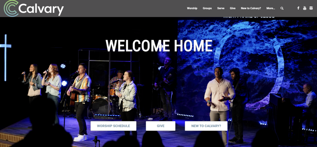
This church website features a simple and stylish design, utilizing a color scheme of blue, white, and gray. The clear navigation system and minimalist layout make the site effortless for visitors to find information.
This website enhances authenticity through high-quality images and videos while promoting community engagement through stories, events, and small groups.
Best Design Elements:
- New visitors section – for first-time visitors, there is a New to Calvary? button that leads to a personalized About page with details about the church, pastor, and community.
- Prayer request – a button on the homepage opens a form where visitors can fill in their prayer requests, a good approach to connecting with the community.
- Watch menu – Calvary Church organizes its live streams so visitors can watch them. It also briefly describes each video to help summarize the message.
16. Christ’s Church
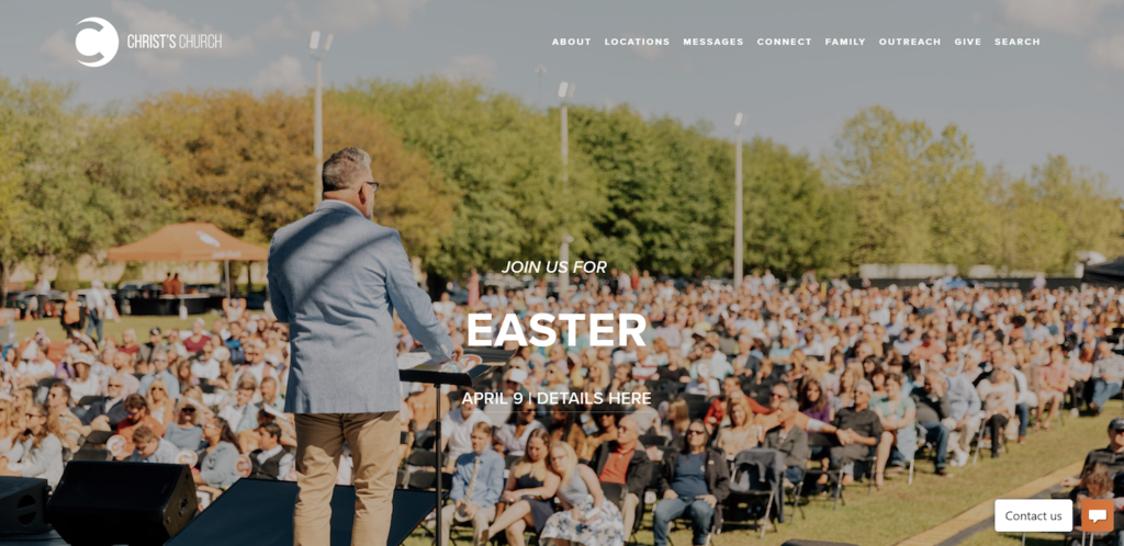
The homepage features a stunning background photograph that catches the visitor’s attention, while dynamic transitions and scrolling features make it more engaging.
The site’s minimalist color scheme is visually appealing and easy to read, and the detailed menu ensures visitors can quickly find the resources they need.
Additionally, this website uses .church as a top-level domain, which is a good way to differentiate the site from other church websites.
Best Design Elements:
- Quick links on the homepage – showcasing a visual menu of quick links to resources on the homepage can help visitors find what they’re looking for.
- Chat box – a chat box and Contact Us option at the bottom of a website helps visitors communicate easily.
- Visual resources list – the site displays a user-friendly visual menu of past sermons, which includes links to YouTube, Spotify, and Apple Music.
Suggested Reading
Read our article about 4 Contact Us page examples for your inspiration to invite communication from your audience.
17. Freedom Church
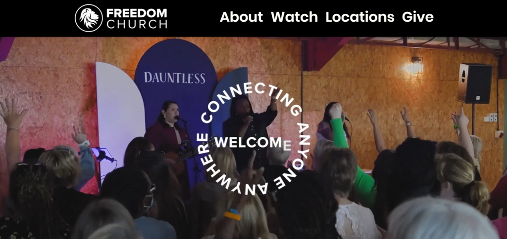
Freedom Church has a modern and sleek design with a black, white, and yellow color scheme. Like other best church websites, the homepage features a large video that immediately captures visitors’ attention. It also displays the church’s vibrant community.
The menu bar is easy to navigate, with links to the church’s mission, ministries, events, and ways to give. It also includes links to the church’s social media pages, making it easy for visitors to stay connected.
Best Design Elements:
- Spotify podcast – in addition to the social buttons, this church also displays its podcast on the bottom of the homepage for easier reach.
- Highly visual announcements – with clear images and a highlighted CTA button, this church can show upcoming events, song releases, and other announcements more efficiently.
- Resources menu – the site’s Watch section organizes messages based on the release date, topic, speaker, and even scripture so visitors can watch sermons online easily.
18. New Vintage Church

While New Vintage Church’s website uses a lot of colors, they are balanced with enough white space to prevent the site from being overwhelming. In addition, simple and engaging language on the site helps visitors feel welcome.
On top of that, the use of animation when scrolling through the site adds an element of fun and interest. Overall, these design elements come together to create a church website that is informative, engaging, and easy to navigate.
Best Design Elements:
- Encouraging message – the homepage of New Vintage Church features an inviting and relatable message that encourages people to join church services.
- Engaging About Us section – the page uses vibrant design elements, a smooth scrolling animation, and dropdown menus to keep it uncluttered. The content is also arranged by relatable topics, such as creation, sin, salvation, and eternity.
- Visiting guide – just like the other pages, this one is equally as vibrant, featuring engaging language such as when we meet instead of simply stating service times.
19. Harbour South Florida
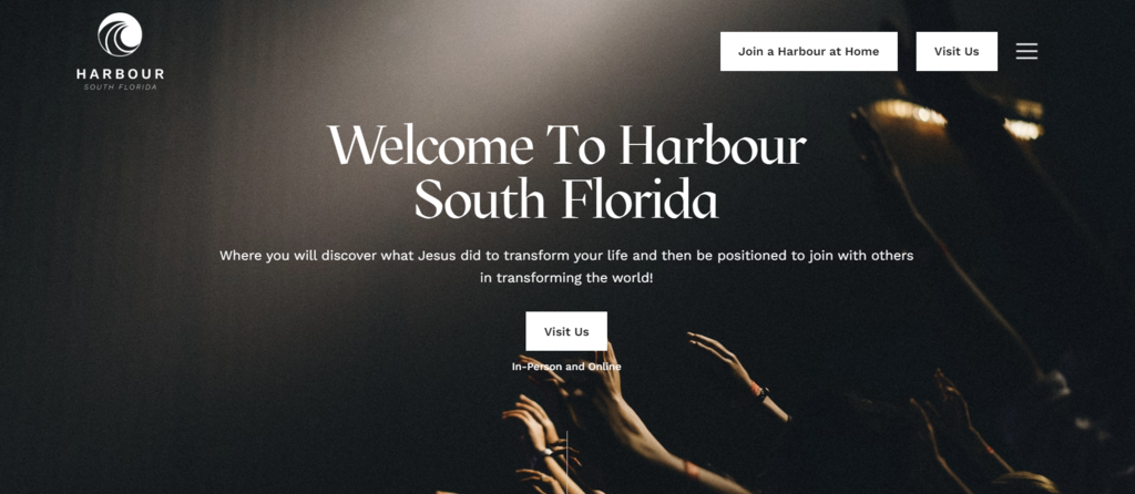
This church website has a simple and user-friendly design with a lot of white space. The homepage is inviting with its smooth scrolling, pleasant visuals, font, and colors.
The CTA buttons and organized menu make information easily accessible. Visitors can also readily access the church’s social media and podcast through the homepage.
Best Design Elements:
- Journey flowchart – Harbour South Florida displays transformational journey steps for visitors when they join the church, making them feel more welcomed.
- Easy-to-access forms – by offering a guest connection card and prayer request form on their homepage, this church appears welcoming and interactive.
- Detailed ministries information – the site offers comprehensive details about its ministries, such as joining procedures, FAQs, and profiles of pastoral team members.
20. The River Family Church
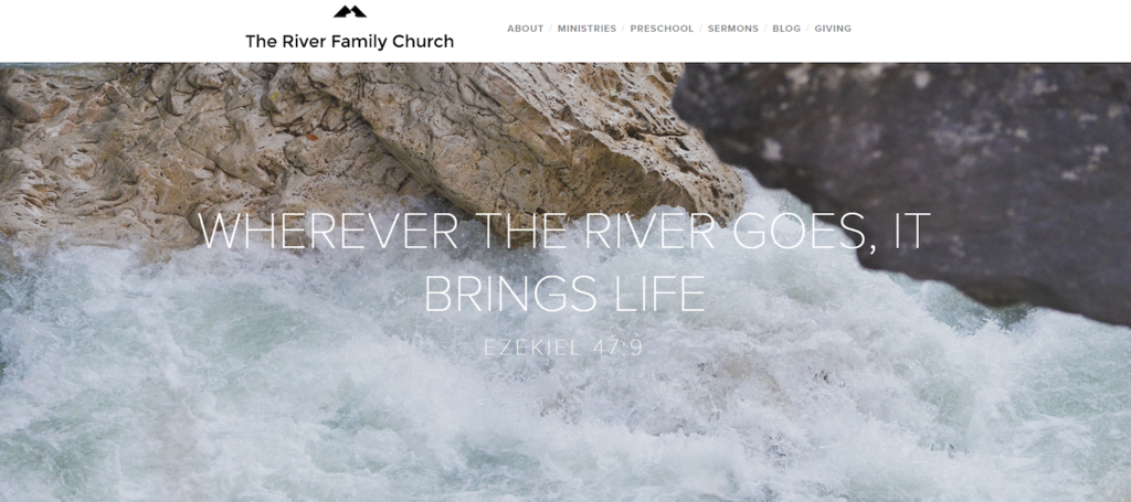
River Family Church is a good example of a simple and easy-to-use website for smaller churches. It shows that professional videos and images are not necessary to create a good website. Instead, you can use stock photos that align with the church values.
Despite the minimal use of multimedia, the website still provides relevant and engaging information about the church in a concise format.
Best Design Elements:
- Blog style content – River Family Church uses a blog format with engaging storytelling paragraphs and question-based section titles to captivate visitors and share their stories.
- Connection form – the church provides a prayer request form to visitors, showing they care about the community.
- Complete sermon list – the site has a comprehensive list of easily accessible sermon recordings you can listen to at your convenience.
Church Website: Best Practices
Creating a good church website involves several key elements. Combined with a good hosting service, the following can make a powerful church website:
- Create easy navigation – organizing information in a logical and intuitive manner, using clear headings and labels, and incorporating search functionality is essential for an easy-to-use website.
- Use web design best practices – good church website design results in a positive user experience. Visitors can focus on the content and the church’s message while avoiding frustration from a cluttered church website layout.
- Include important information – the best church websites always include important information, such as service times, location, contact details, and information about your church’s mission and values.
- Make it responsive – having a mobile-friendly website is essential to reach more people.
- Incorporate multimedia – using photos, videos, and graphics on a church website can enhance the visitor’s experience and present information in an engaging and dynamic way.
- Add sharing buttons – the best church websites use social media icons so that people can share their website’s content on social media easily, which may help the church site reach a wider audience.
To ease the process, we recommend using Hostinger’s simple website builder to create your own church website. Equipped with user-friendly AI tools, various templates, and 24/7 customer support, it enables you to create a fully-functional site within a few hours.

Conclusion
A great church website can build up a church’s image, communicate values, create an online resources library, and promote events. Moreover, a church website can benefit both existing members and new visitors by providing easy access to information.
In this article, we’ve explored the best church websites as inspiration. Below are our final recommendations and what you can learn from these top church websites:
- Passion City – best use of multimedia.
- The Sanctuary – best in promoting upcoming events.
- Valley Creek and CenterPoint – best in organizing resources.
- New Vintage and Harbour South Florida – best in using scroll-triggered animations.
- Cedarcrest, Elevation, and The Orchard – best I’m New pages.
Feel free to leave a comment below if you have any questions about making a church website.

Mulan is a Digital Marketing enthusiast experienced in creating social media content. She is eager to help people learn in the simplest way possible. During her free time, Mulan likes to cook and watch sci-fi or documentaries.